

The Project.
Breaking and Bending is an upcoming theology podcast that bridges the gap between theology and everyday life. Podcasting is the first step to bigger projects for the brand.
Previous Design.
The previous logo had a sound concept but was not resolved. There were important elements that were further developed in the final design.
Branding Alignment Sessions.
A series of branding sessions were conducted. I facilitated discussions and exercises to clarify the brand values, and understand the story, goals and user profiles.
Band Value Proposition.
Bending and Breaking provides a Theological Experience to Open-Minded listeners in a Dialogical environment with an Accessible voice. Helping them feel Engaged and Curious while they are listening.
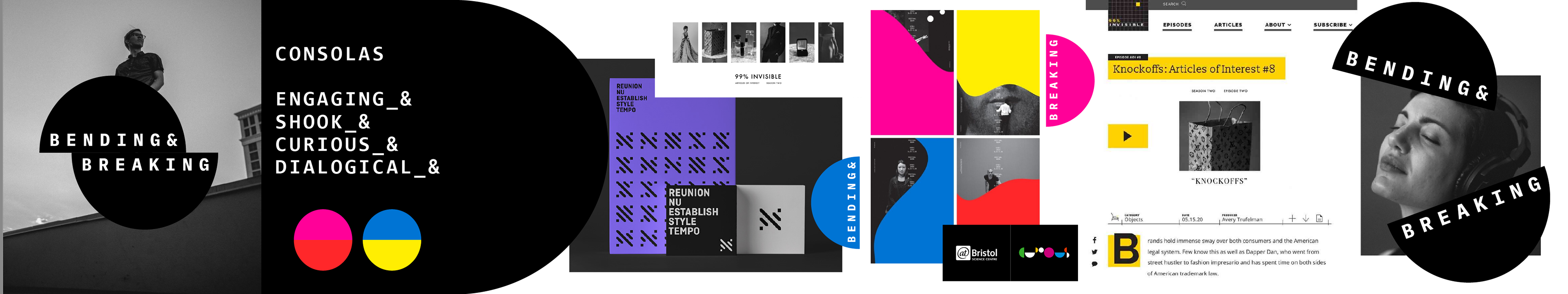
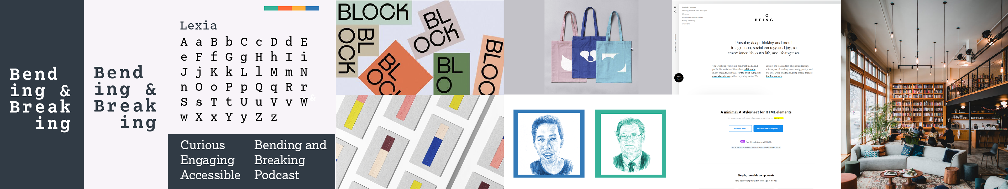
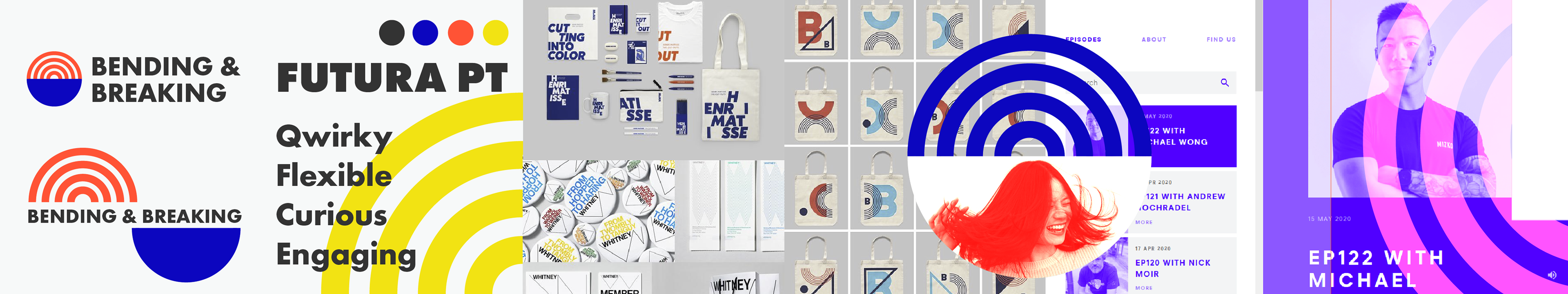
Stylescapes.
With the brand define I began exploring different visual directions and logos. I presented three stylescapes to the client. Using this we discussed, explored and focused on the right direction for the identity.
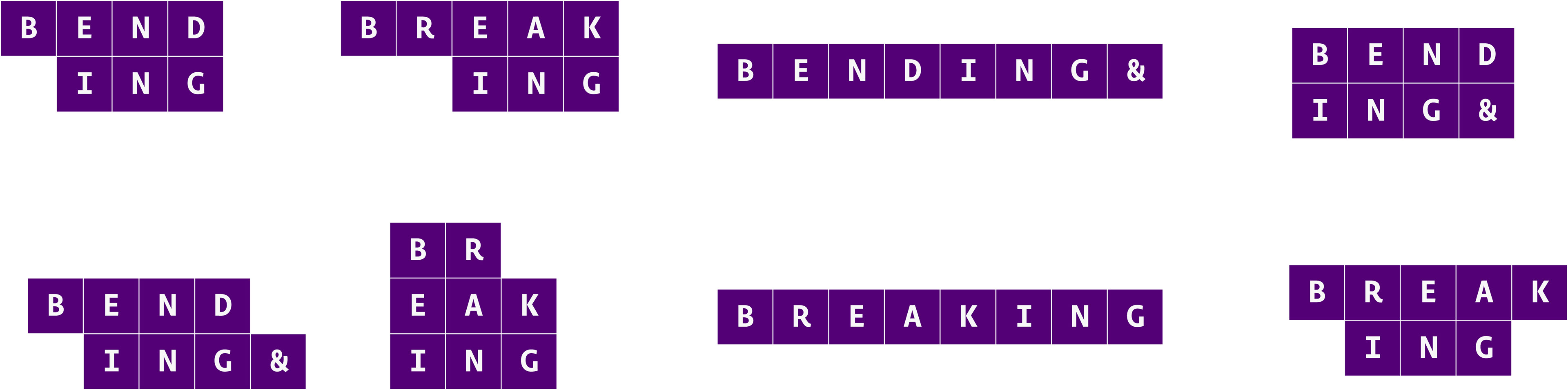
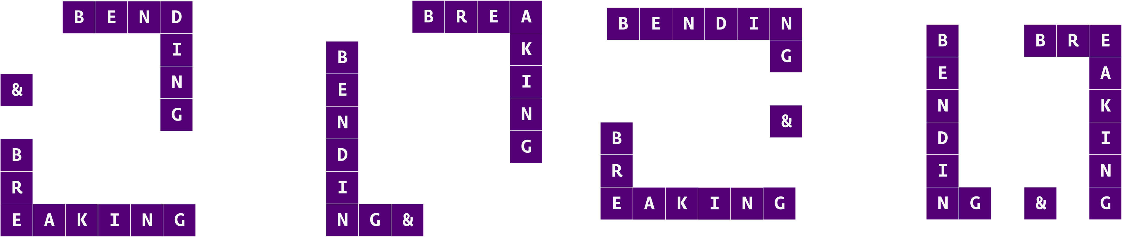
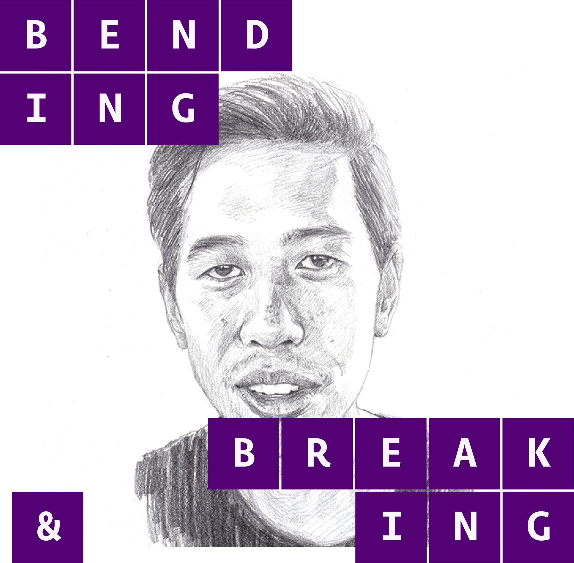
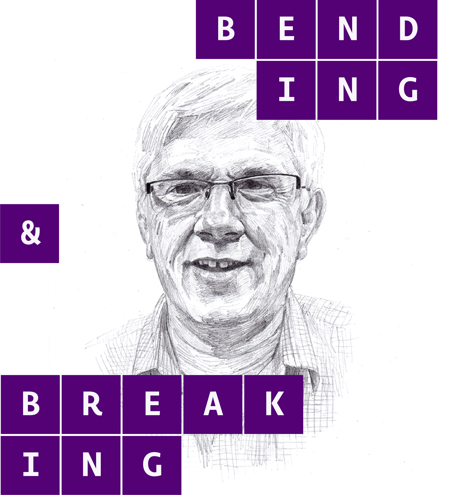
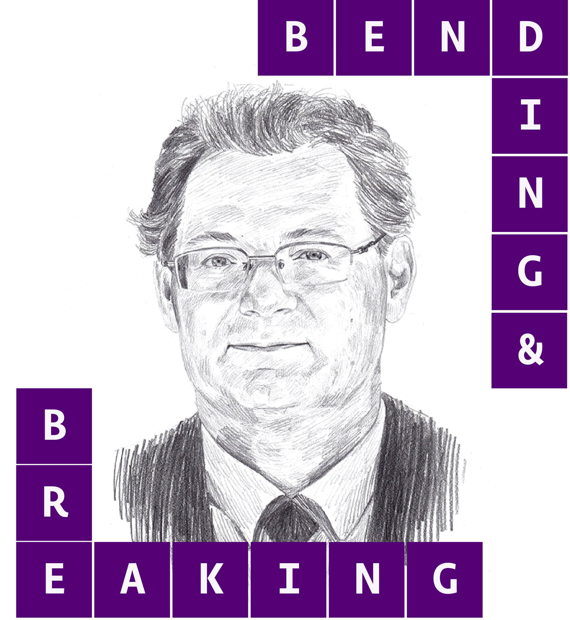
Bending and Breaking in the right place.
This was the key concept of the brand. It shifted the direction towards a visual identity system instead of a static logo. Bending and Breaking's visual identity became a visual metaphor for the brand's philosophy.
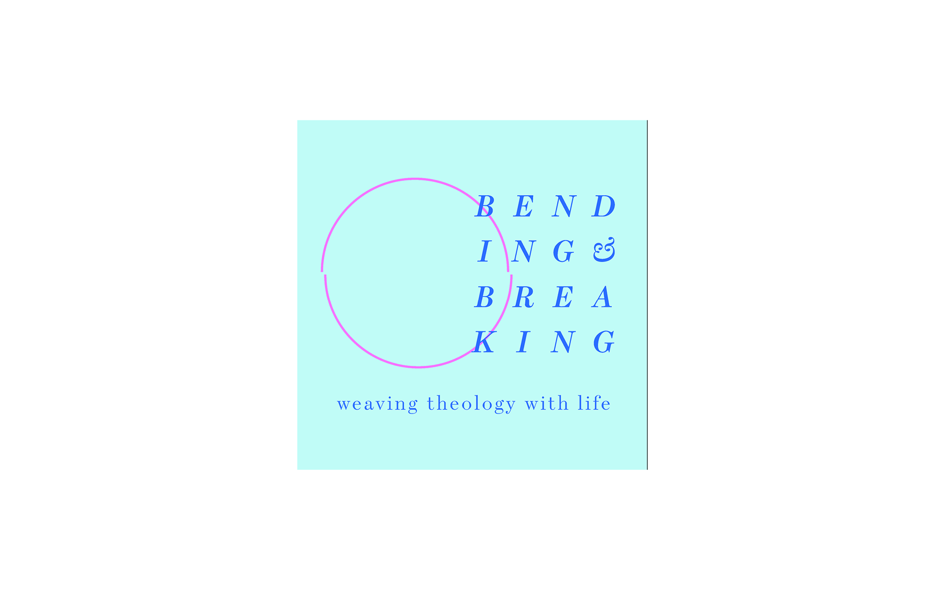
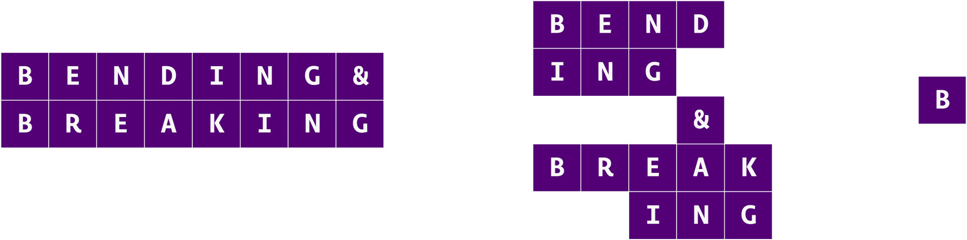
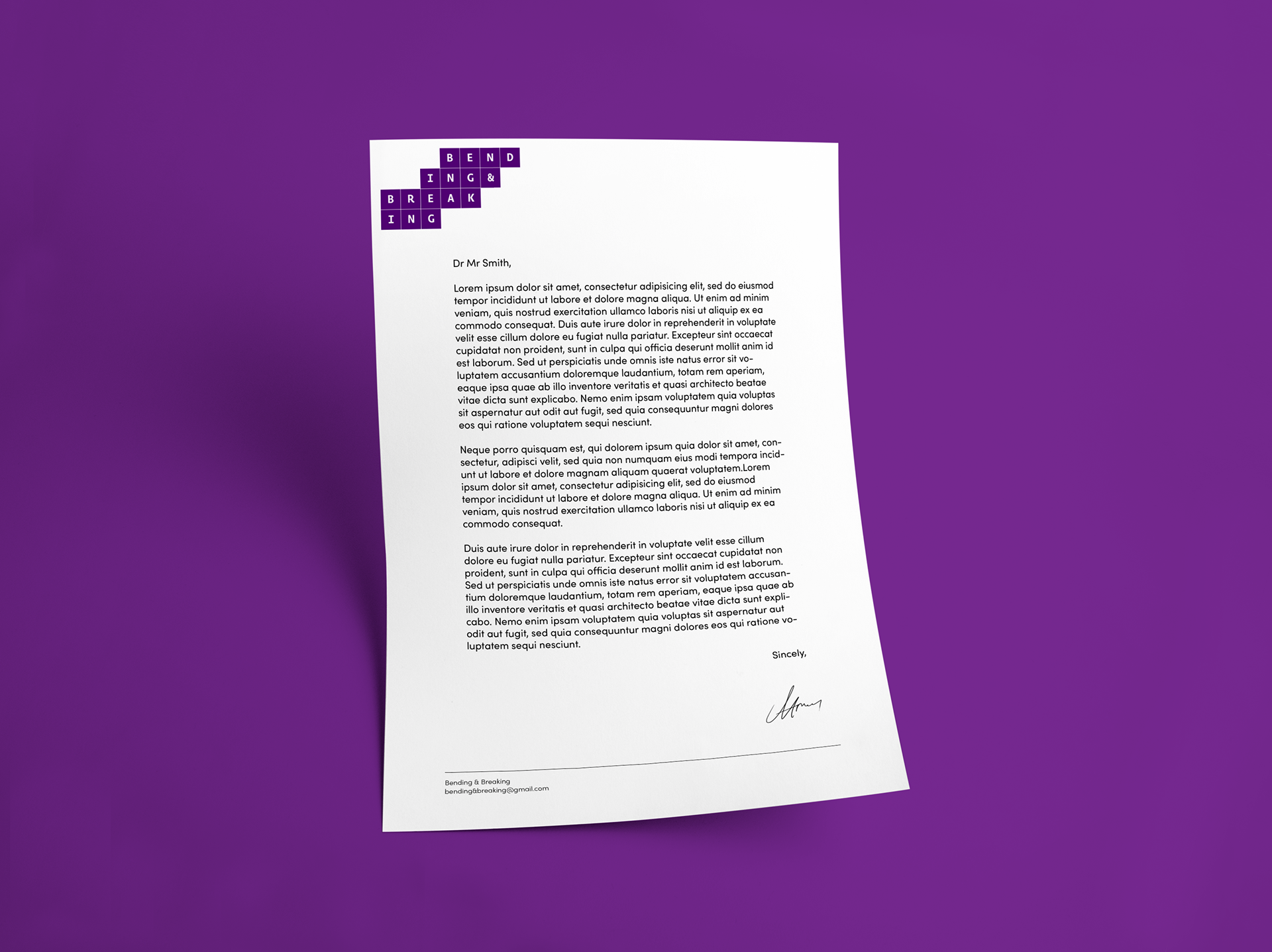
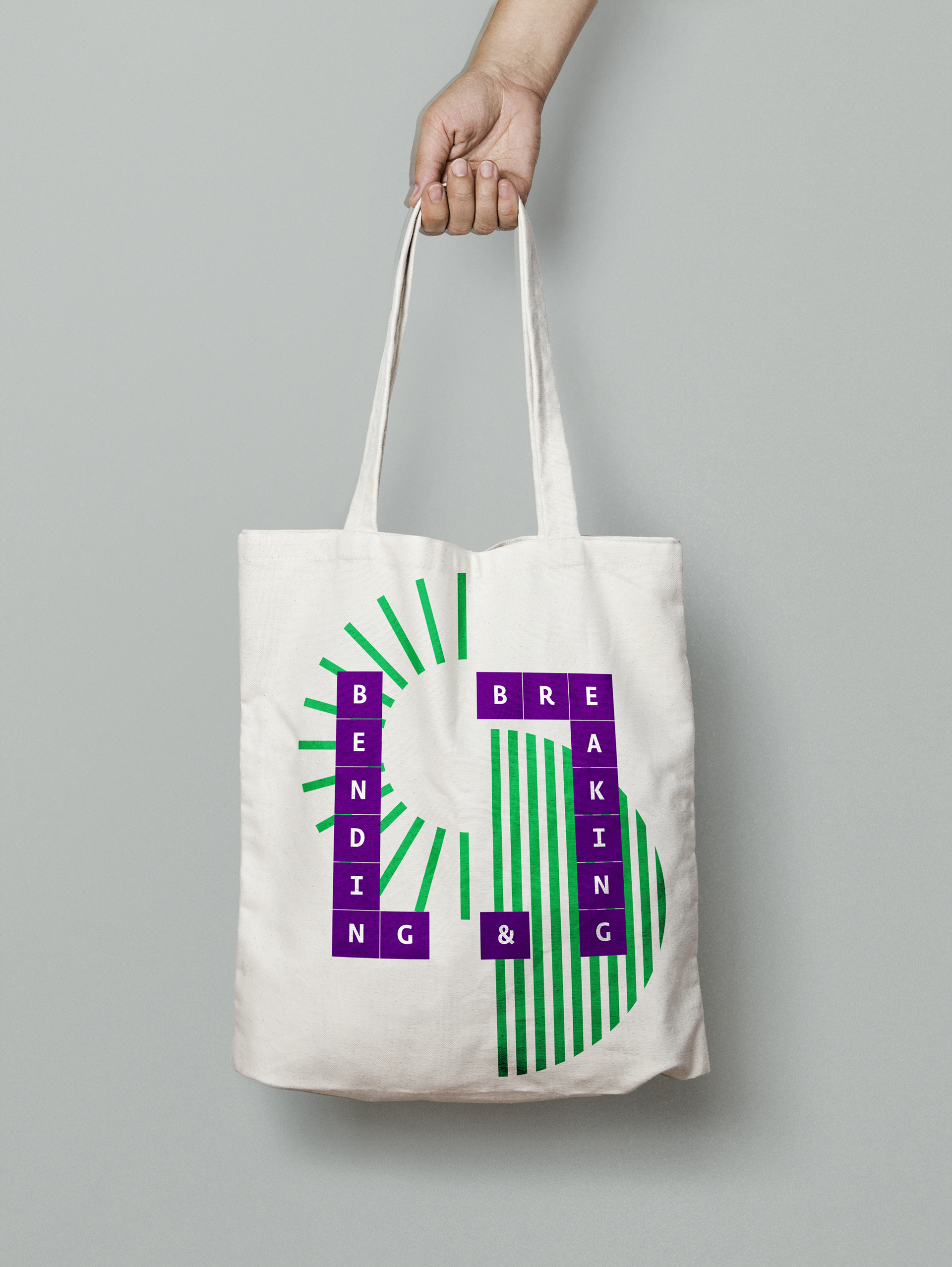
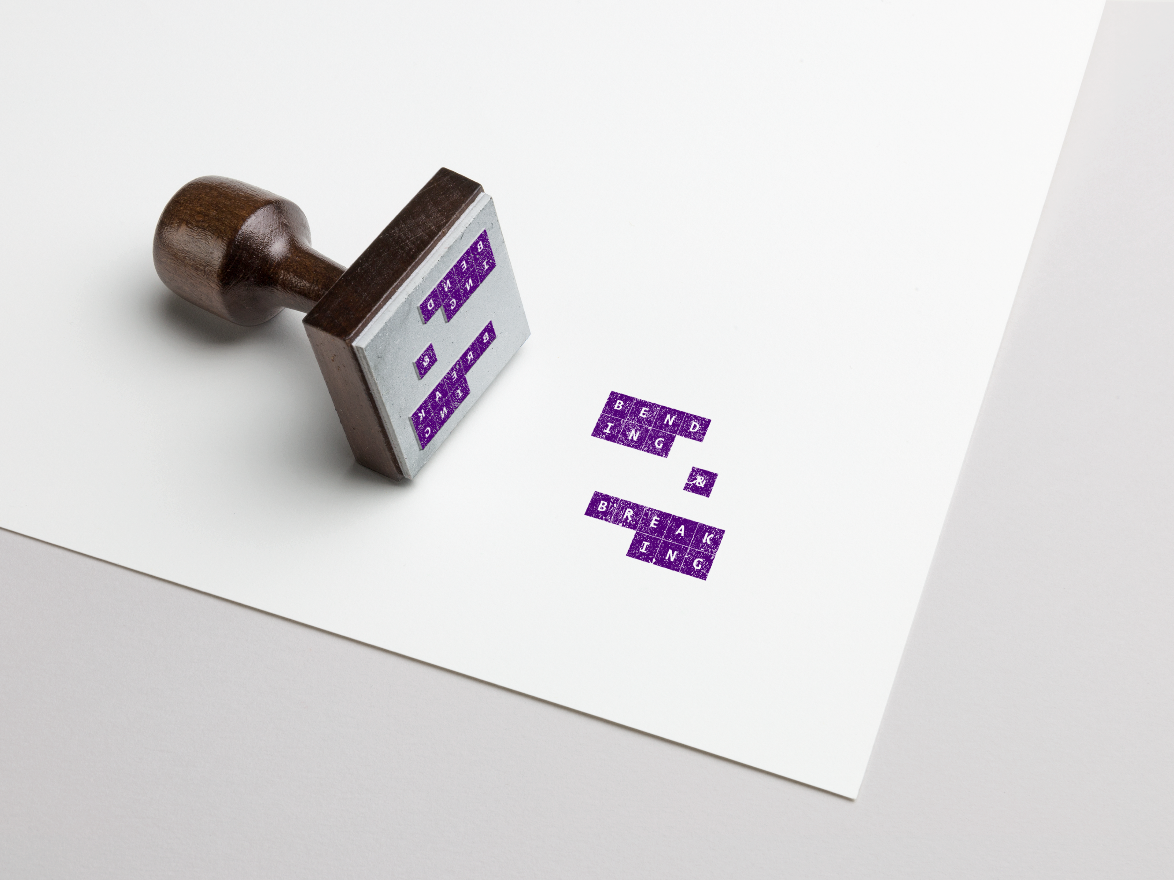
The Logo.
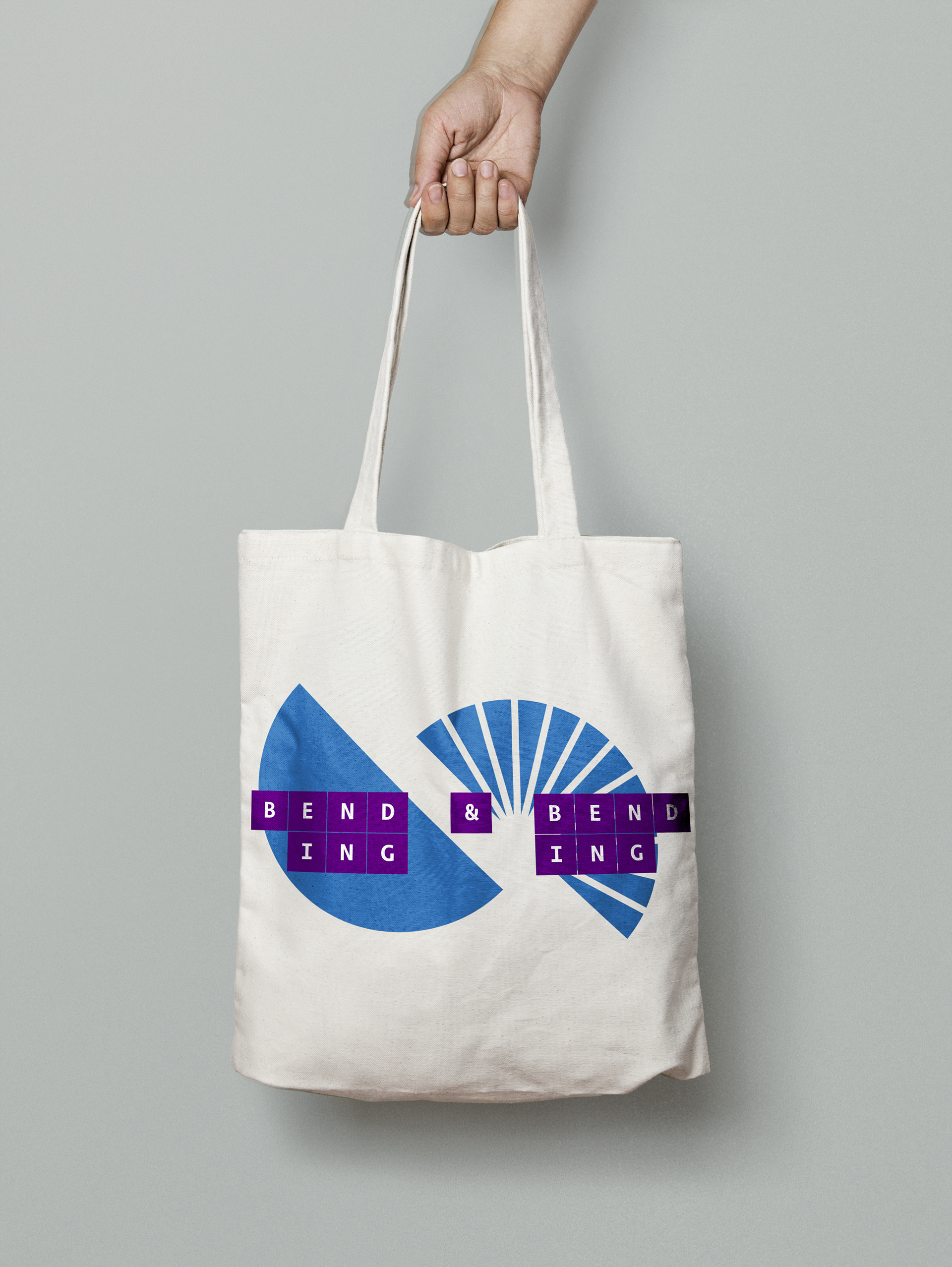
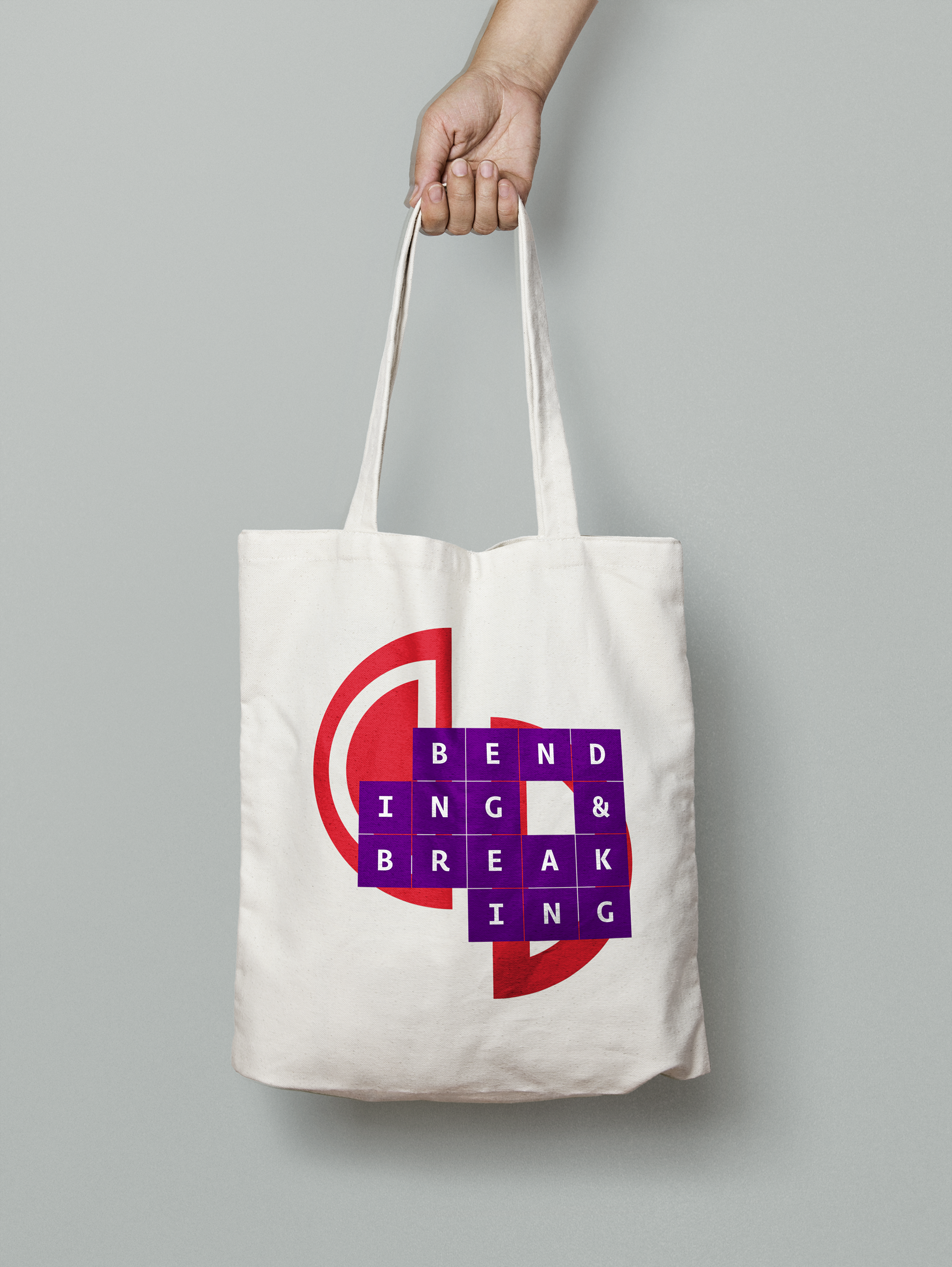
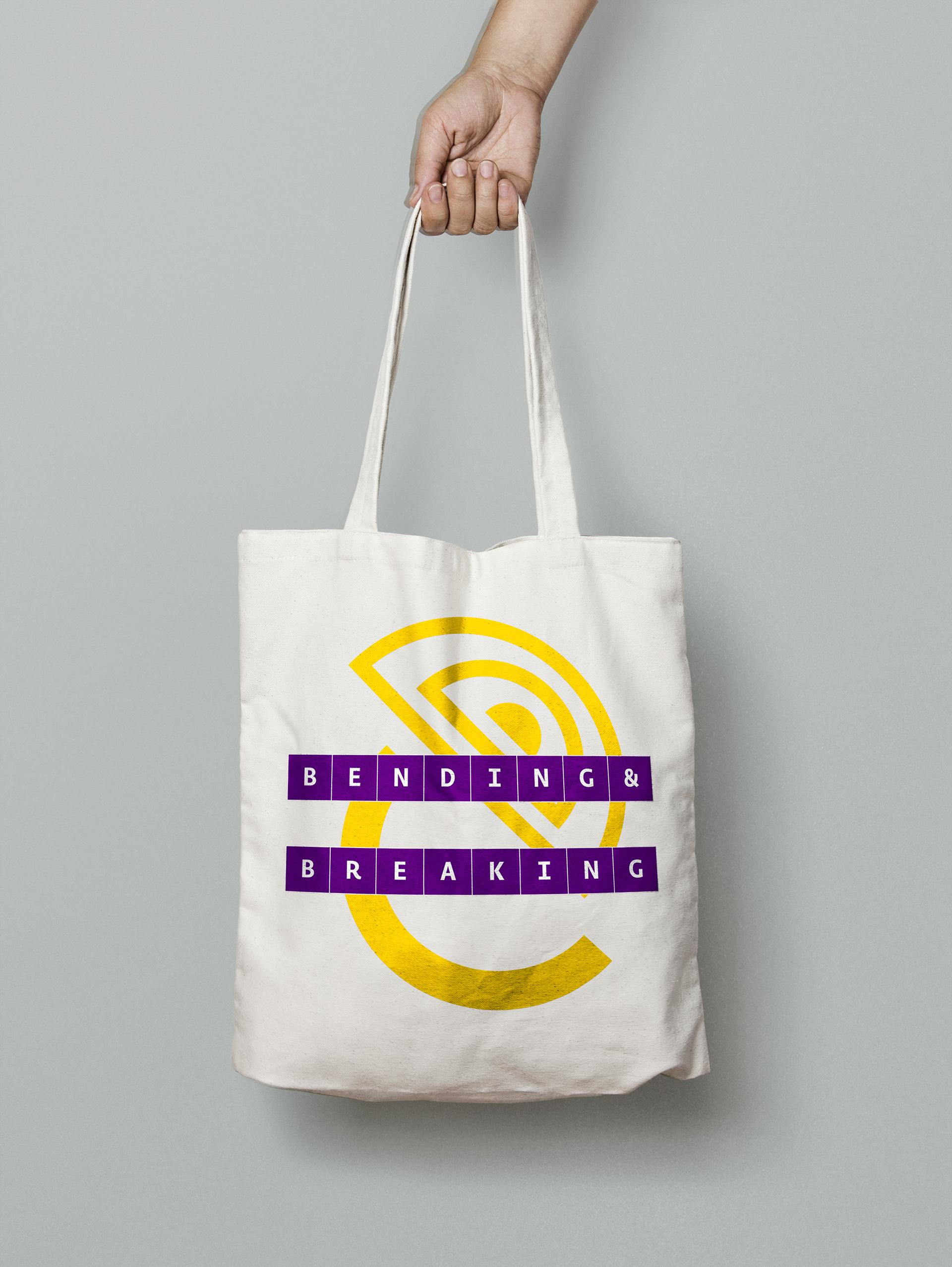
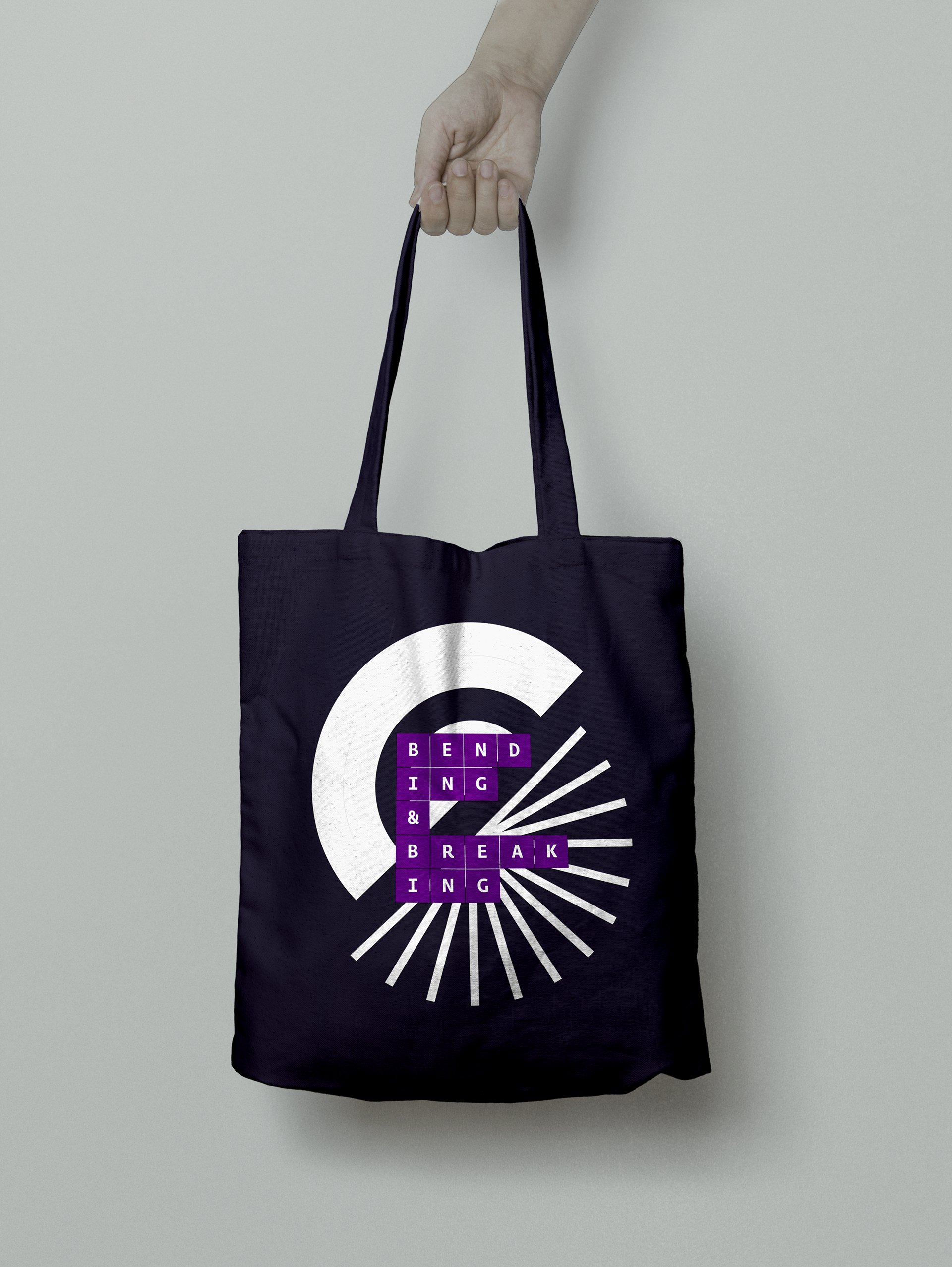
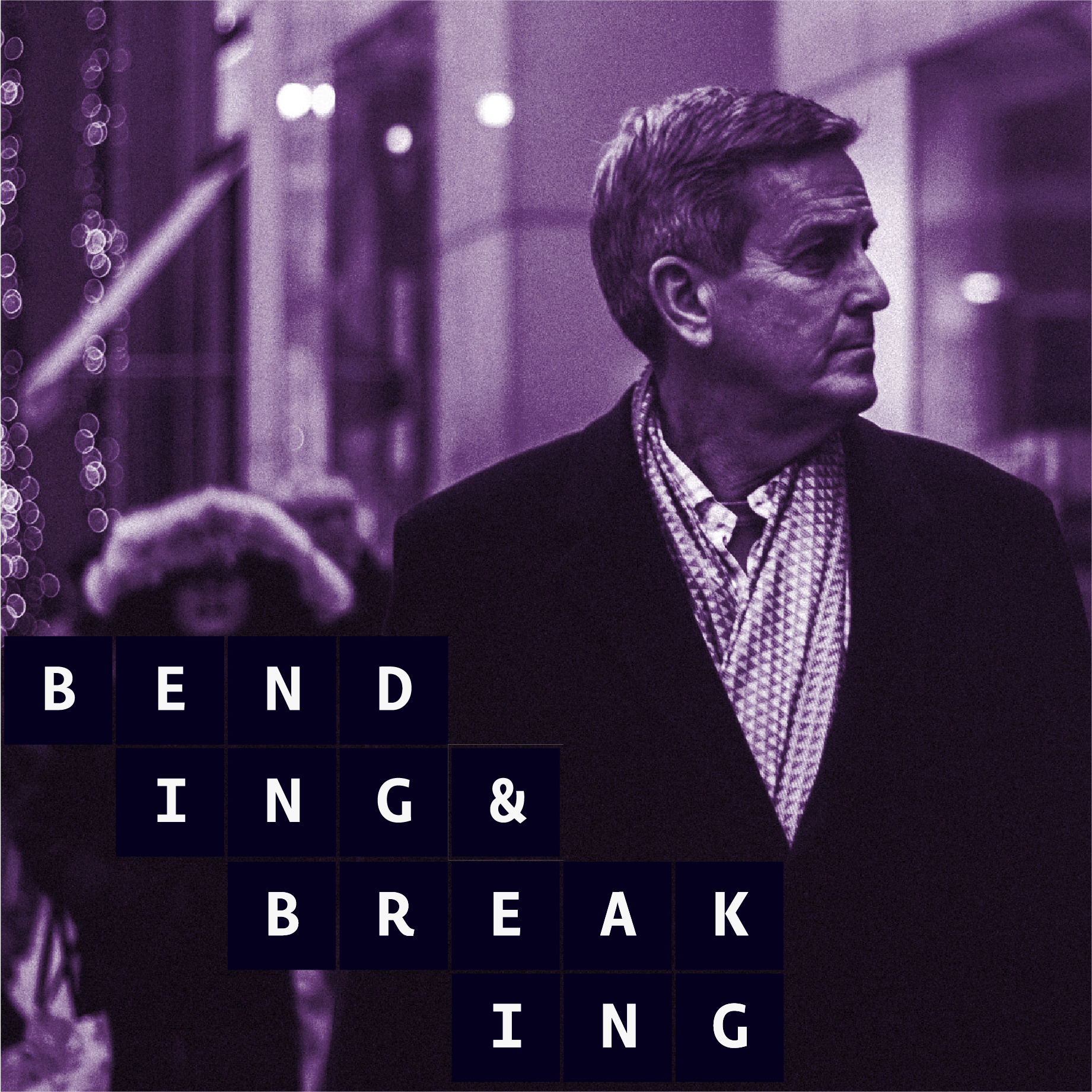
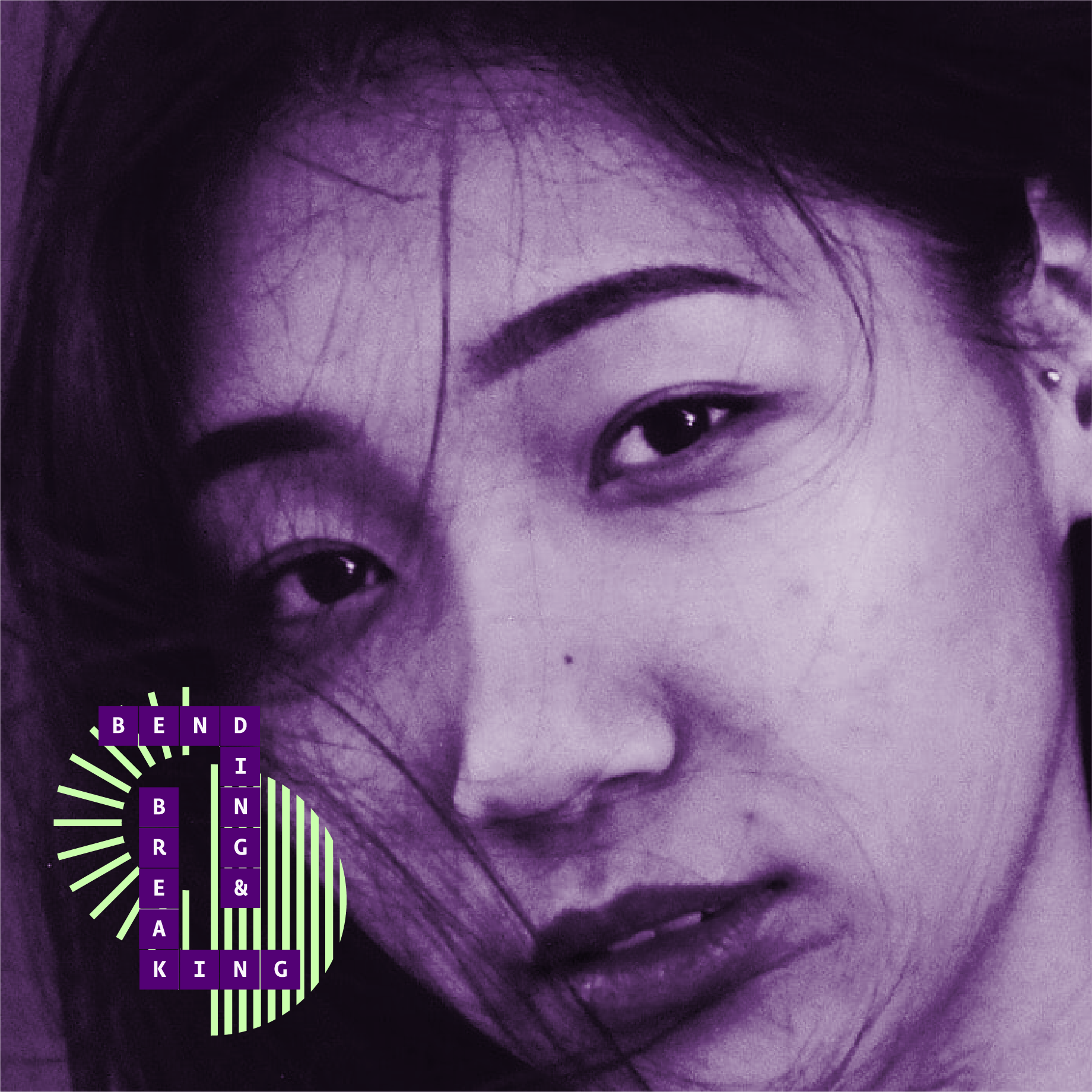
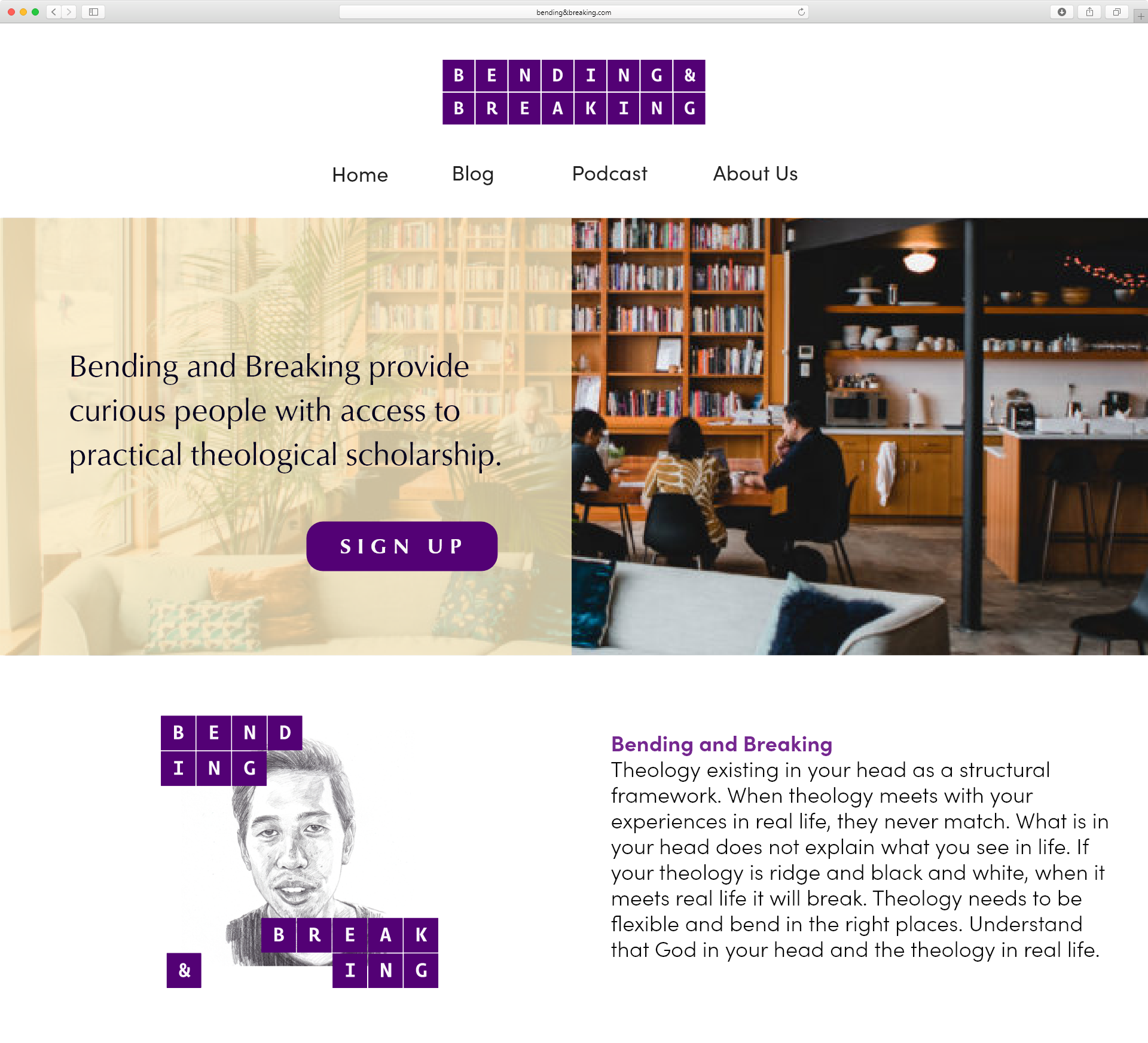
The logo was designed as a series of pieces. Resembling building blocks or pieces to a puzzle. The logo is designed to bend and break apart. It is a dynamic logo system that encourages change and adaptation.
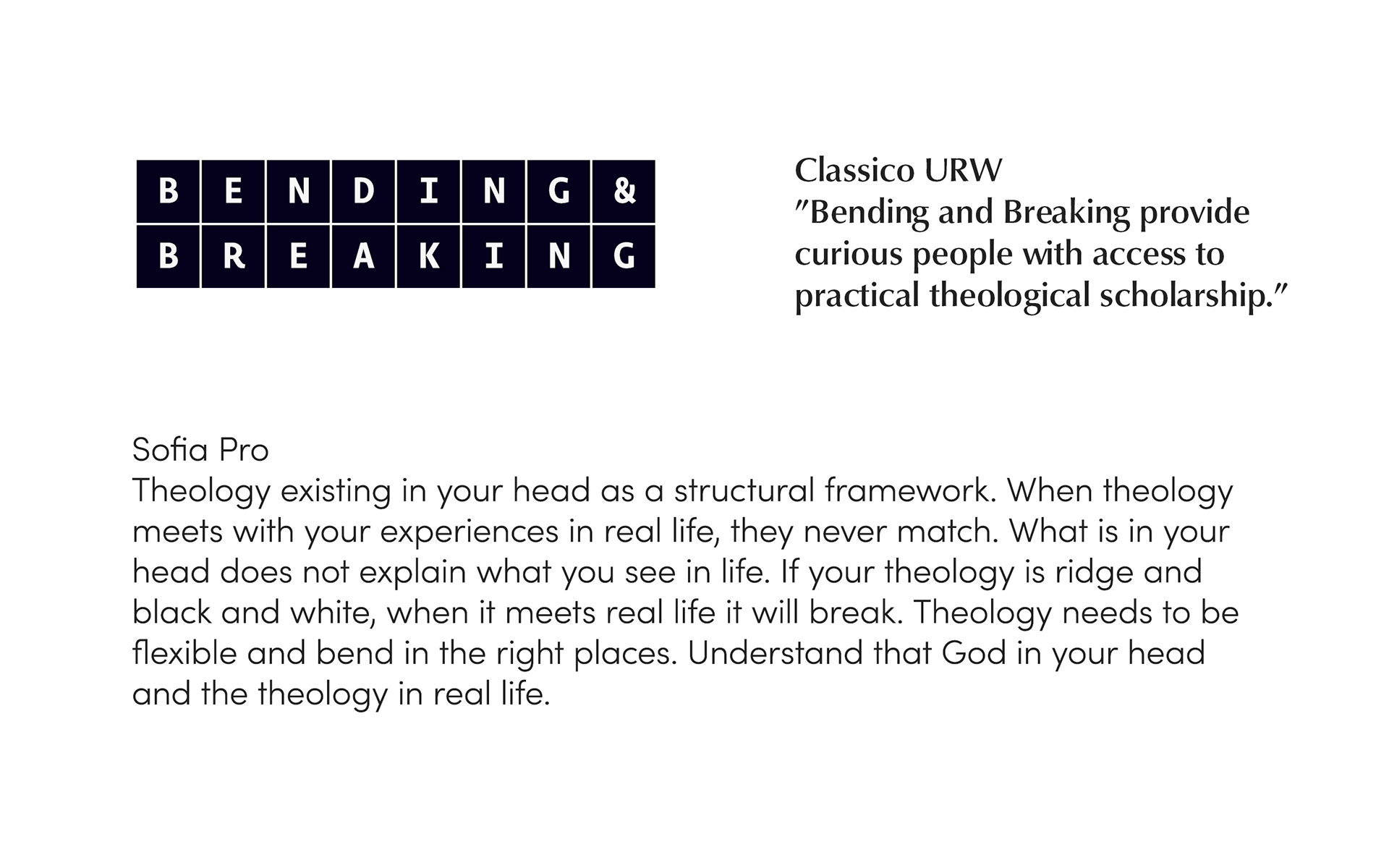
Typeface.
The chosen humanistic typefaces provide a friendly, modern and welcoming look to the brand.
Circles.
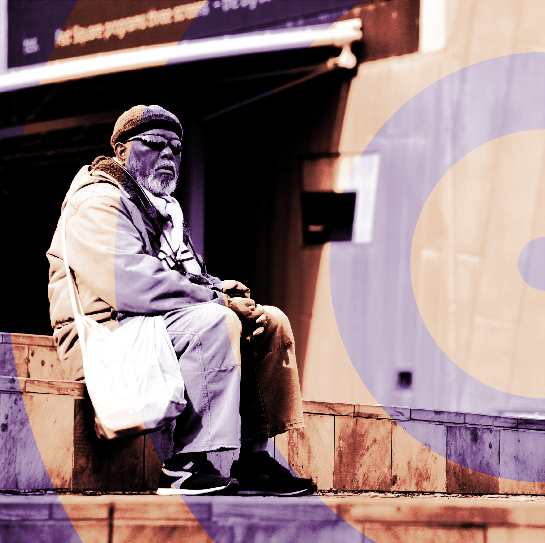
The circle concept in the original logo shifted into a visual motif instead of being part of the logo. The circle represents the balance and tension between theory and practice coming together. Unique circles comprised of two different semicircles represent theory and practice coming together. These illustrations are designed to be used together with the logo.
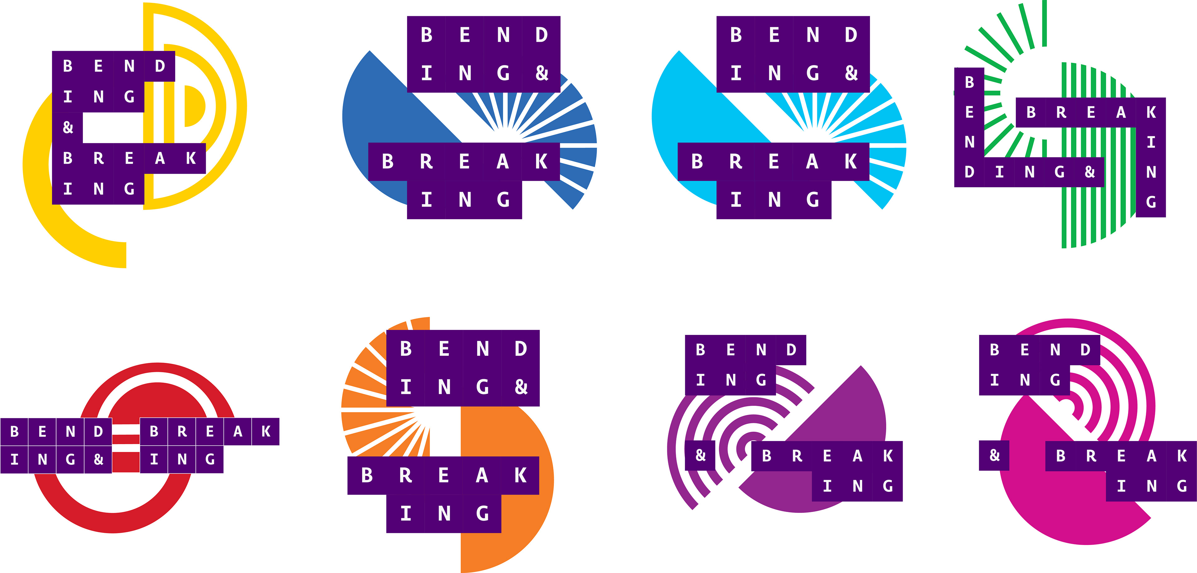
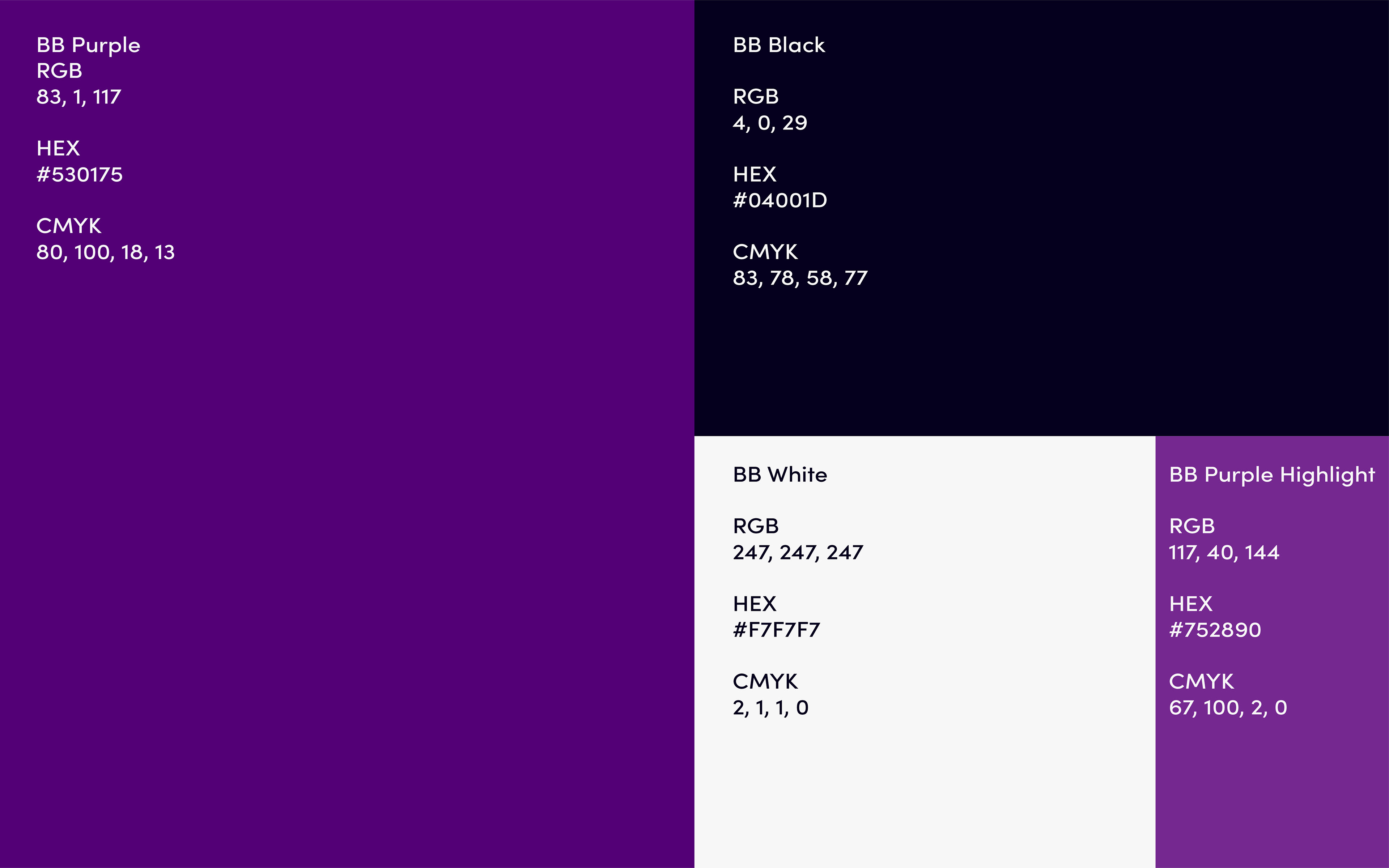
Colour.
The colours represent the creativity and quirkiness of the brand. It was also chosen to differentiate from the competition. A deep purple was chosen as the primary brand colour. The colours give an engaging, informative yet creative tone to the identity.
Secondary colours give the brand more colour flexibility in its designs. A muted palate was first pitched to compliment the primary colours. The client instead wanted more vibrant colours in the final design.
The brand and style guide.
A brand and style guide was developed check it out here.
Result and Testimonial.
This is the second time I’ve worked with Jason now he just gets better! I’m in the process of starting up a podcast and knew that I’d need clear branding to communicate my ideas. Jason took me through a thorough process of defining, not just my brand, but my whole concept. After it, I not only had a visual identity that perfectly expressed the values of my brand but I had a clearer vision in my mind of my own business.
John Hie.