

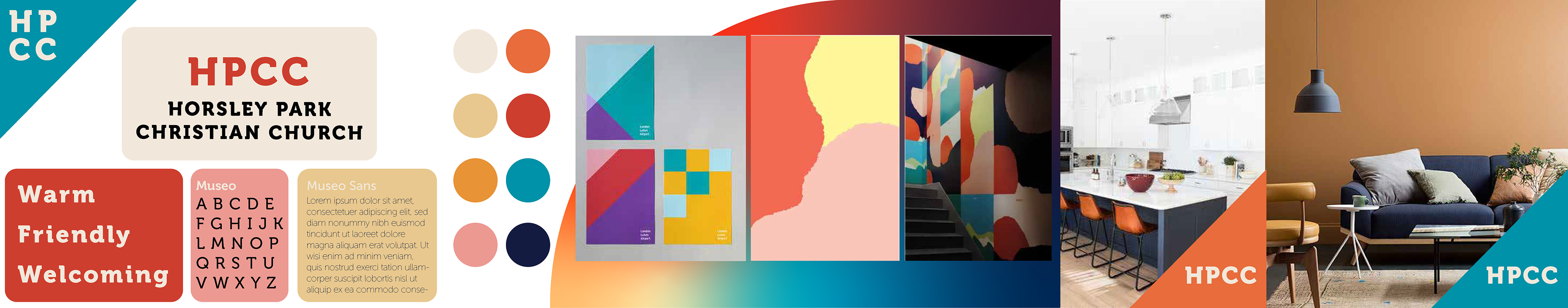
The Project.
Chung Chen Chinese Christian Church, underwent a rebranding of its English congregation. The church has a reputation as an exclusive Chinese church and the re-branding aims to fix this problem to better serve the community. The English service was renamed Horsley Park Christian Church (HPCC) and needed an identity refresh.
The Brief.
The brief for the project had the following requirements:
Warm and welcoming.
Clearly communicates that we are a church.
Ethnically neutral.
Classic/timeless.
Communicates a focus on Jesus/God/gospel.
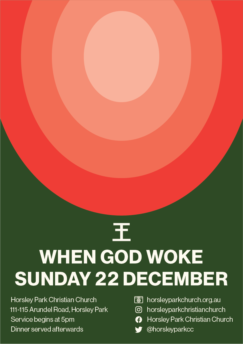
Subtly references to the idea of king or gift.
Subtly hints at the Chinese origins of this church.
Used on a variety of digital and printed materials.
Need colour as black and white.
Establish church colours.
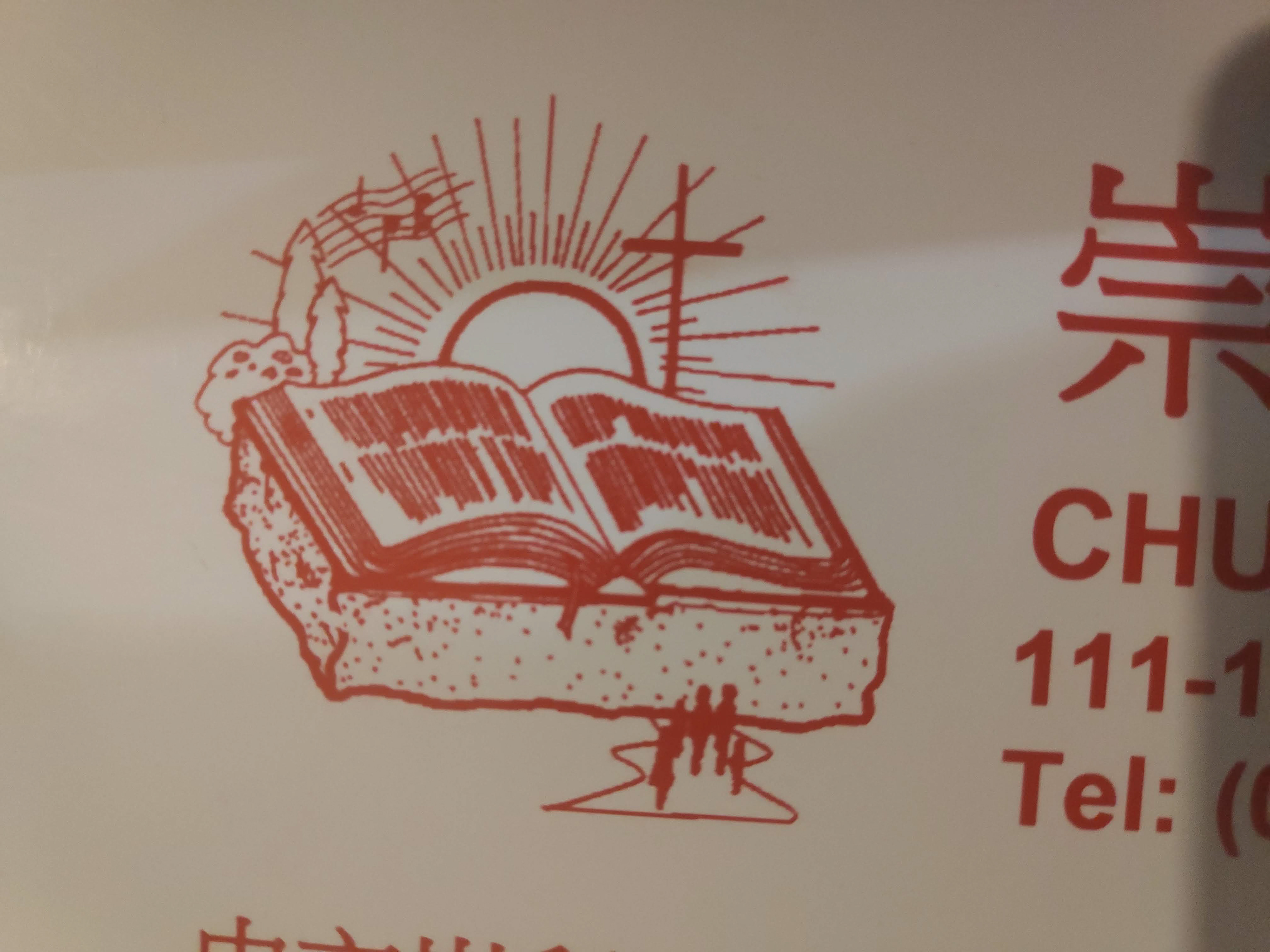
Previous Identity.
The previous identity was over 30 years old and did not fit with the new direction. The logo was a very detailed illustration imbued with many meanings originally designed as a newsletter illustration. It does not work as a modern logo as it was too detailed and does not scale. There was no set identity system and the collateral showed no visual cohesion. More important the identity did not align with the rebrand and its new objectives.
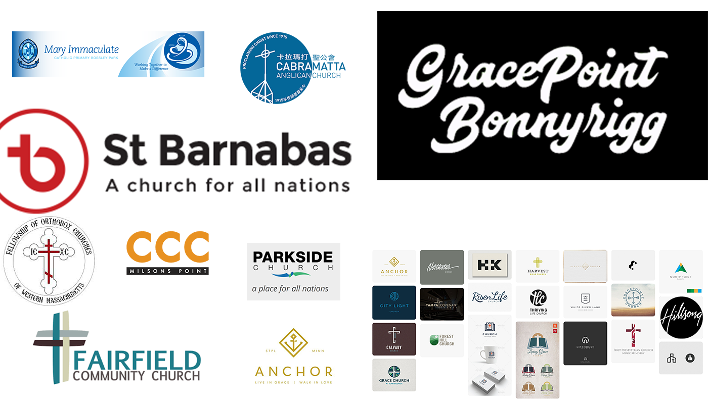
Competitive Set.
Initial research began with other church identities. A competitive set was established and shown to the client. This helped clarify the visual direction of the brand and how it will look in context.
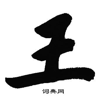
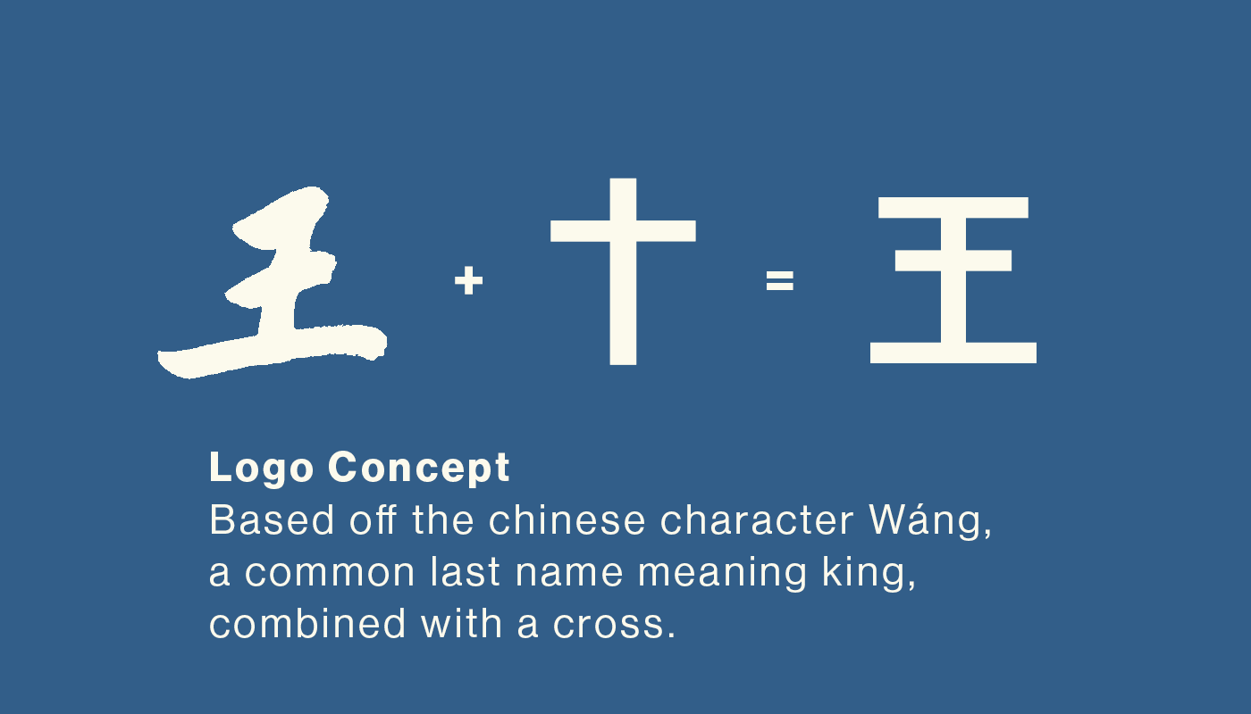
Wang Concept.
During the research, the idea of using the Chinese character Wang was pitched as a solution to the new logo. Wang means king in Chinese and ties in with the king's gift idea. This concept was well received and exploration was encouraged.
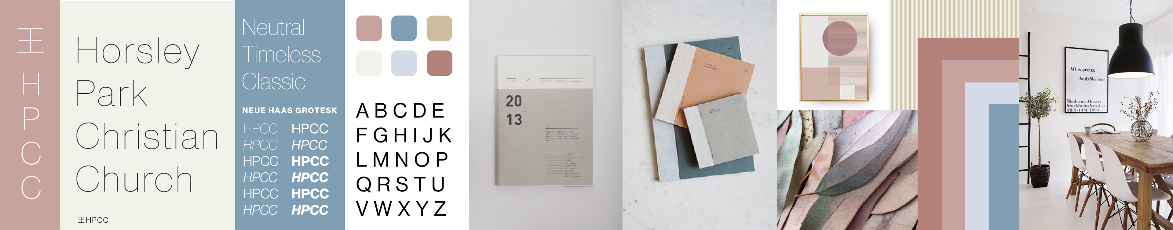
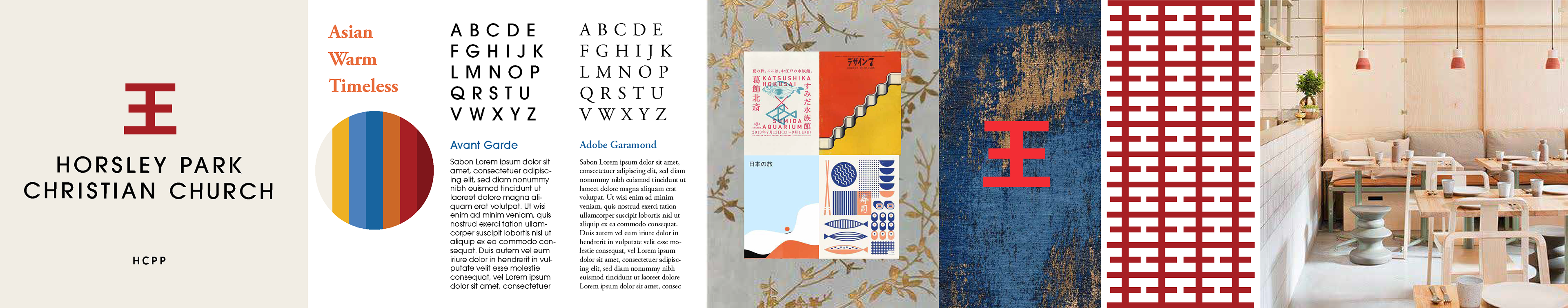
Stylescapes.
Stylescapes were created to explored 3 design directions.
Logo Iteration.
Whilst client feedback was positive, the client had concerns about the prominence of the cross in the design. Iterations of the logo refined the final design to find a form that could best bring out the cross.

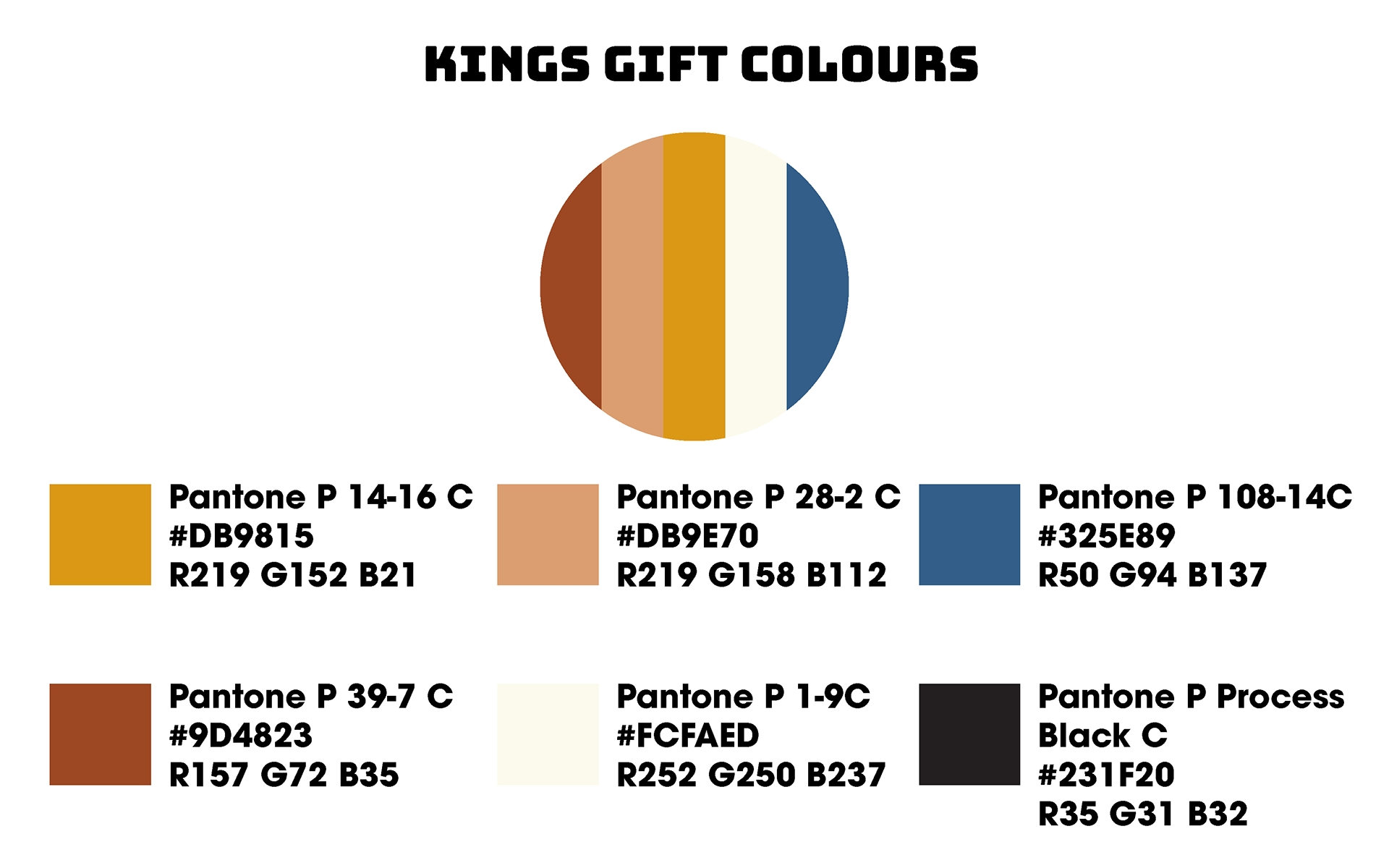
Kings Gift Colours.
The final brand colours incorporated the idea of the king's gift theme. Inspiration came from the story of Jesus's birth and the gifts of gold, frankincense and myrrh.

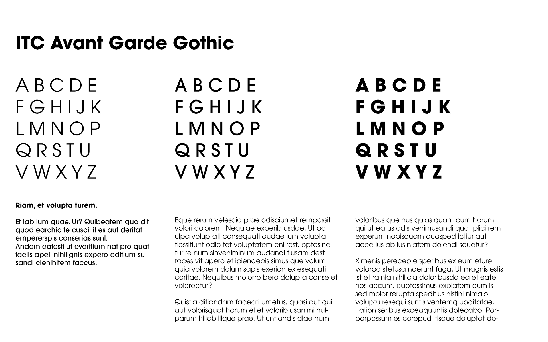
Typography.
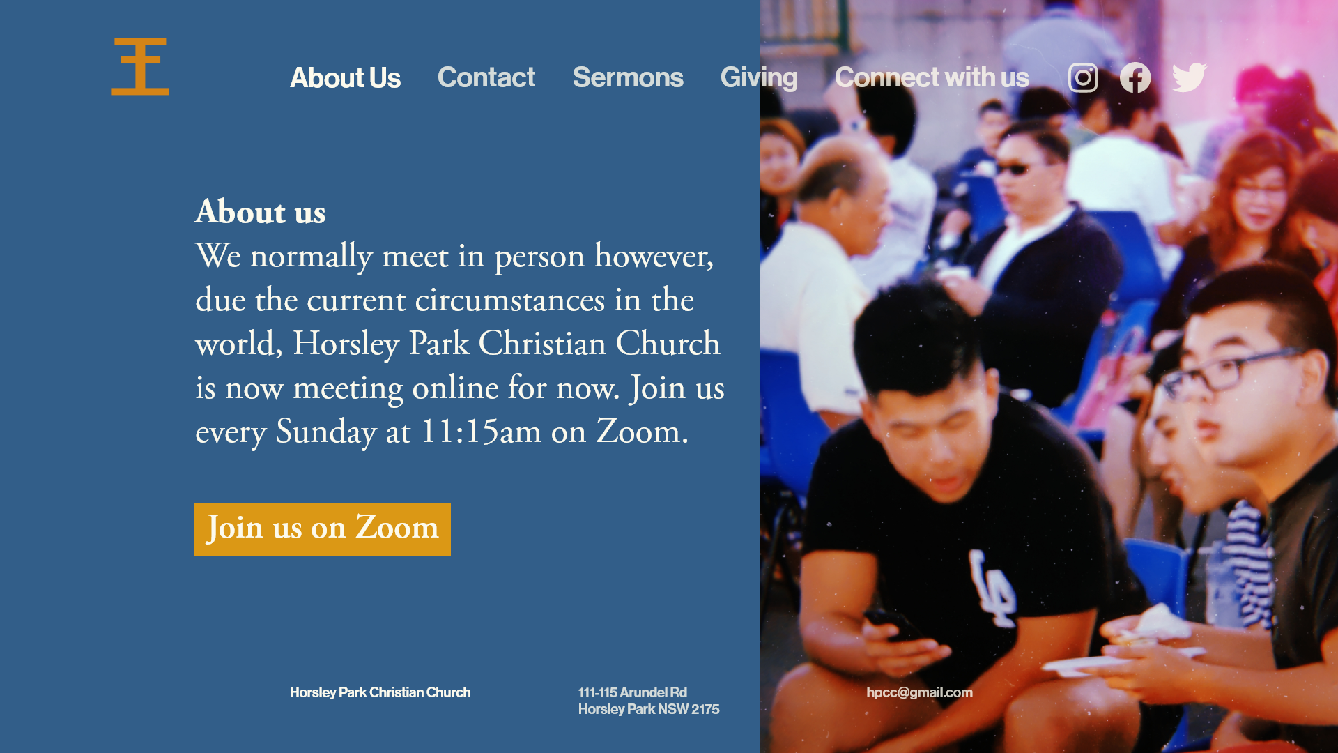
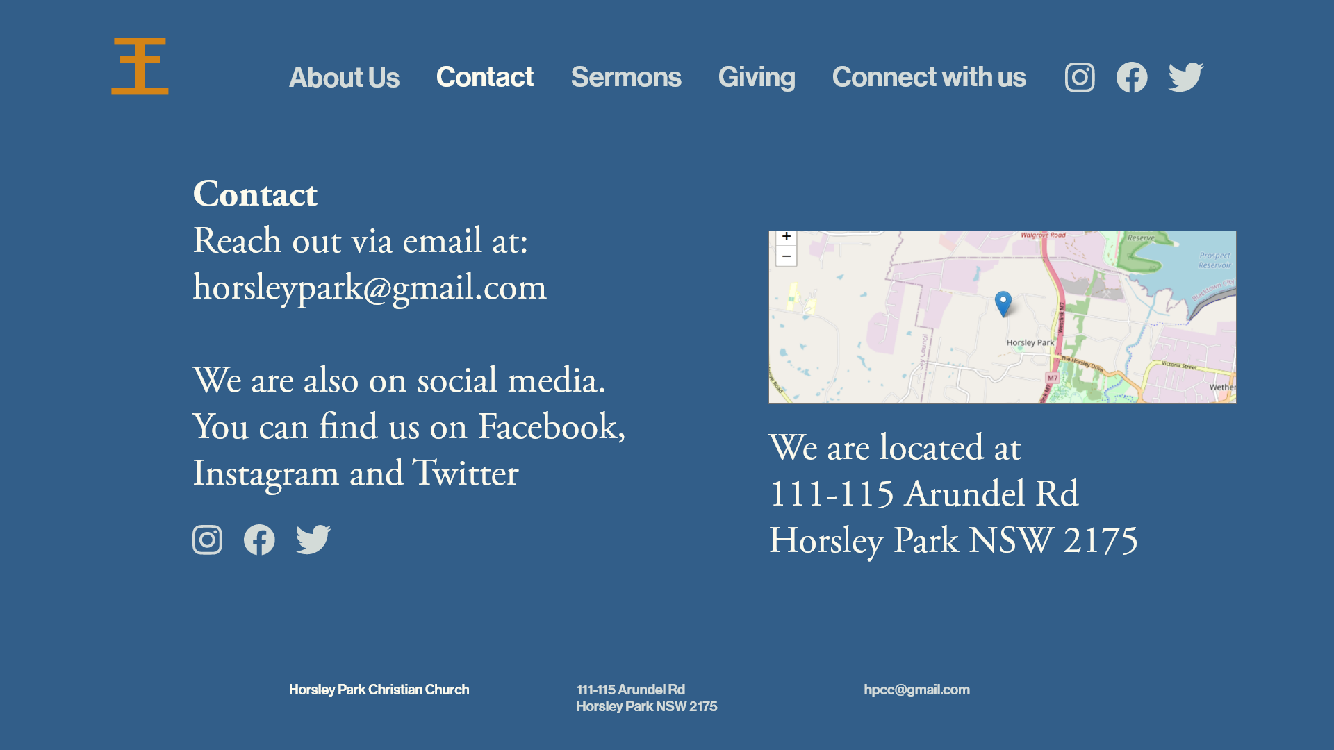
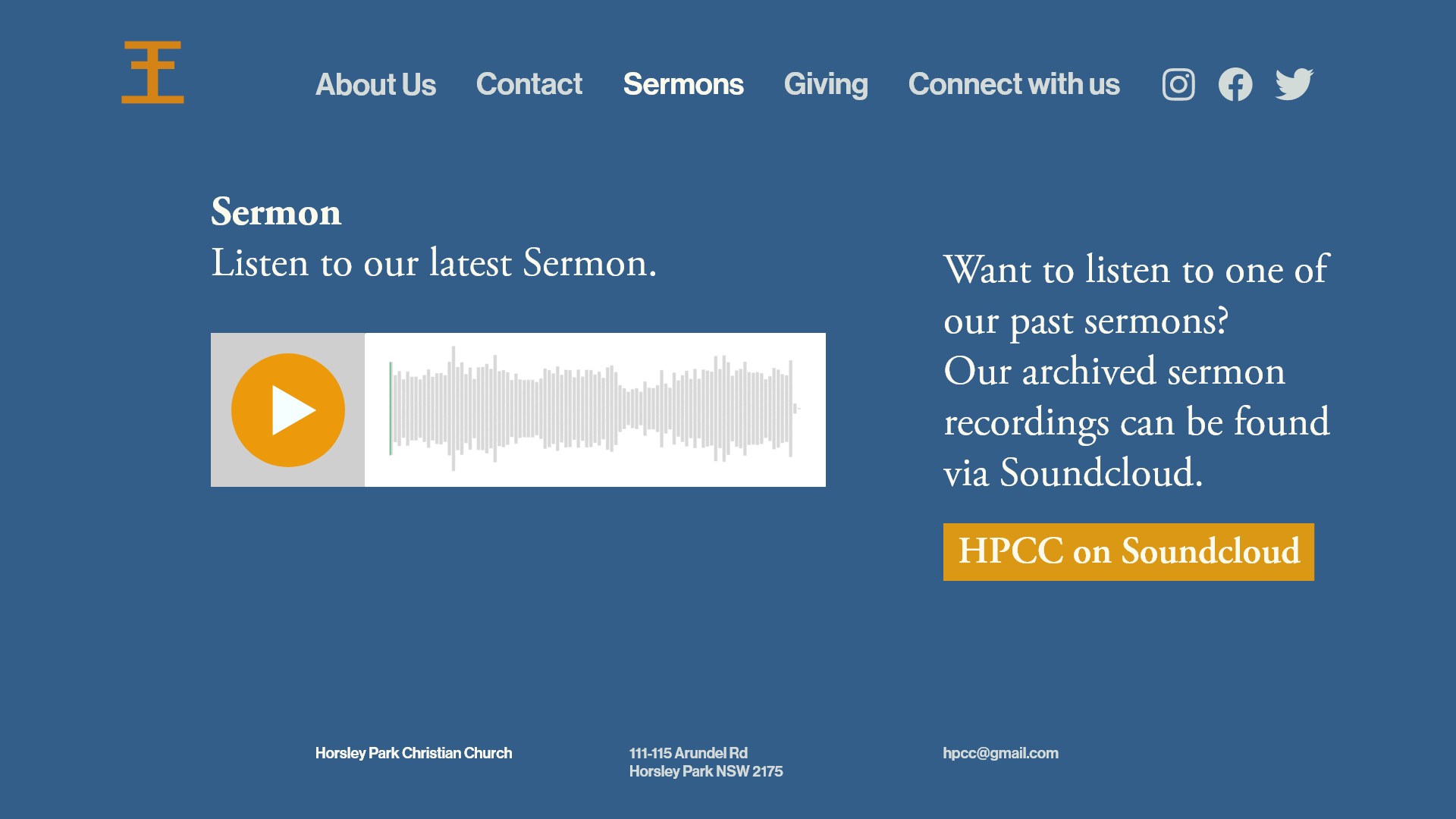
The chosen typefaces provide the classic, timeless and neutral quality for their brand. This decision allowed the focus on the message instead of the typography. Typefaces were also chosen based on cost restrictions and accessibility for non-designers to use.
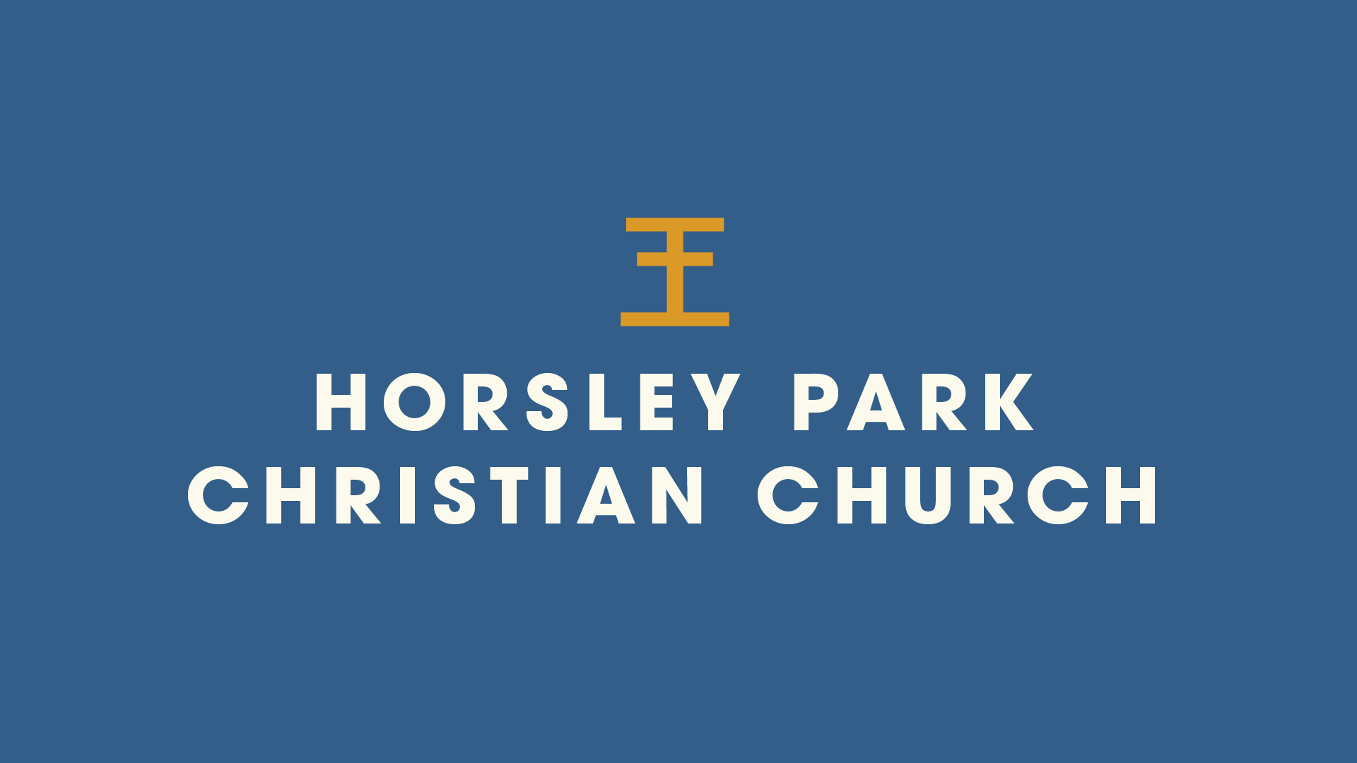
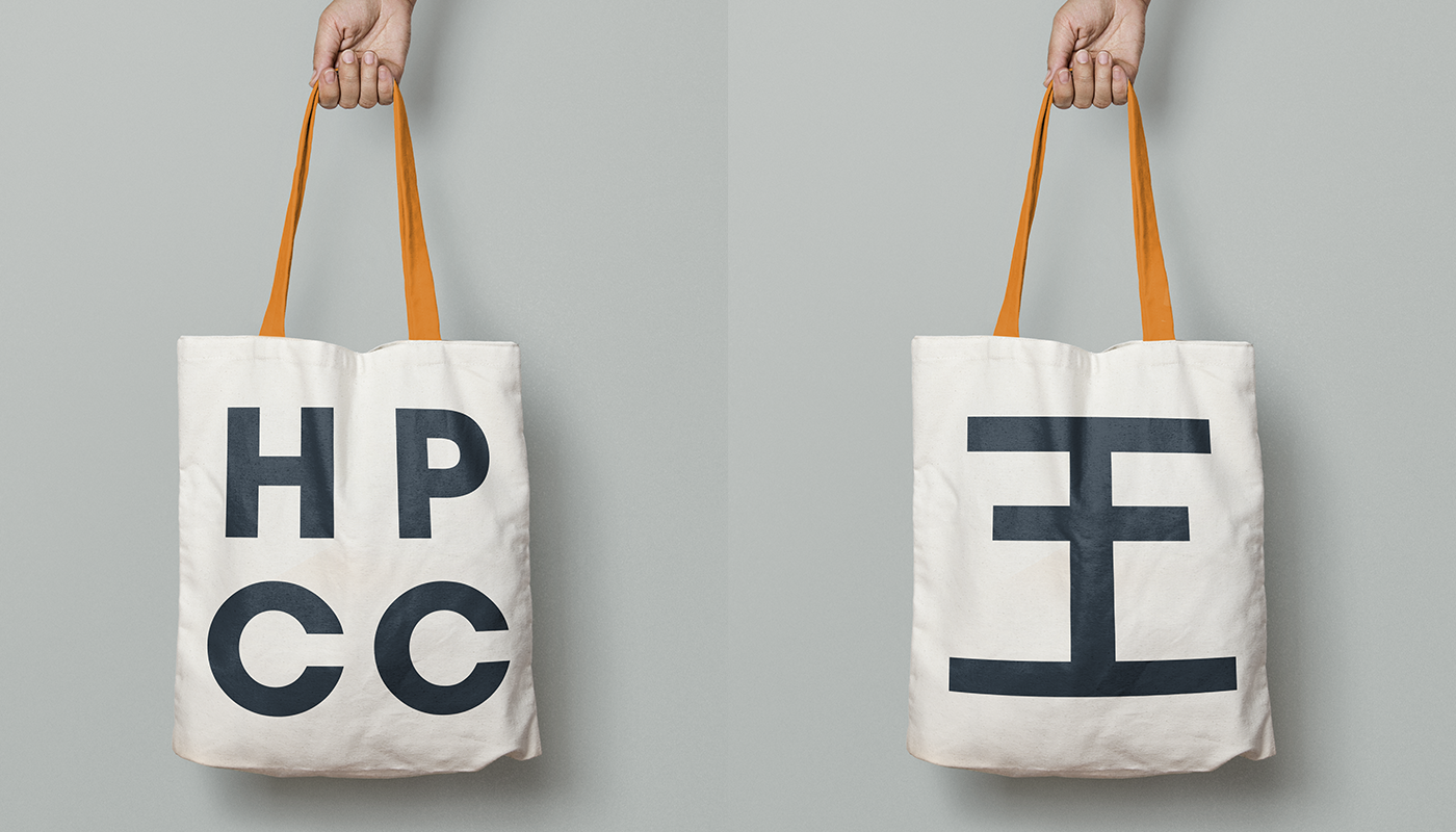
Final HPCC Logo.
The final design incorporated the wang concept as a unique cross for HPPC. The logo provided HPCC with a modern and timeless logo that referenced its heritage. The conceptual form allows for members of the church to have conversations about the history of the church and the king's gift.


Results.
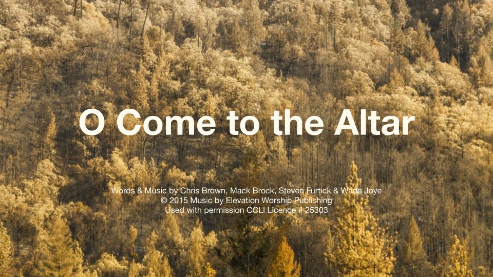
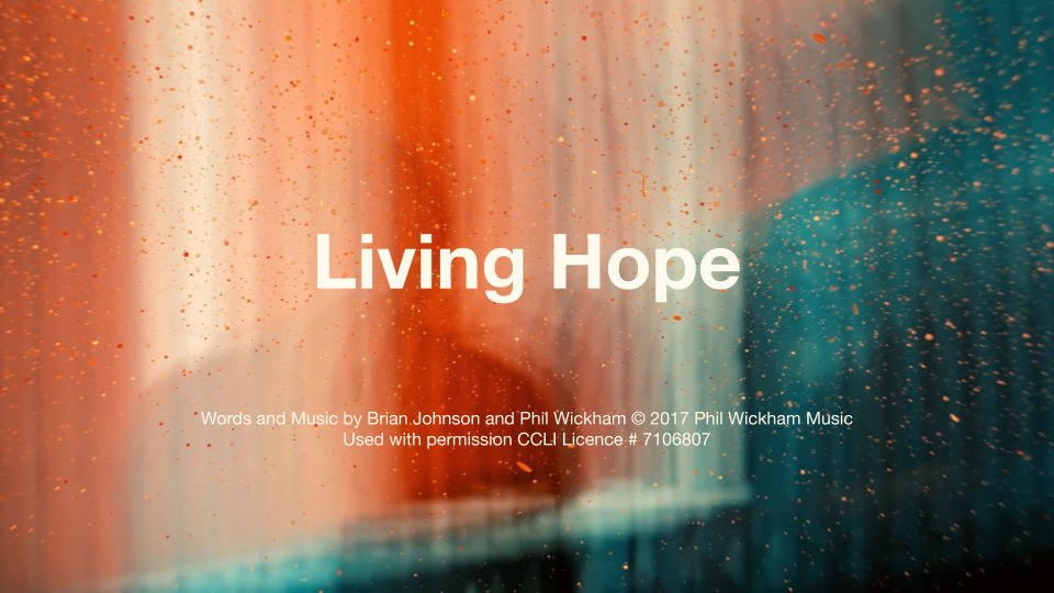
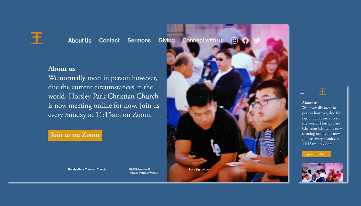
The identity has been rolling out across their collateral and the congregation has been positive to the change. They love the consistency and clarity, especially the redesigned presentation slides. HPPC has also seen an increase in engagement across all their social media and the church has attracted newcomers.
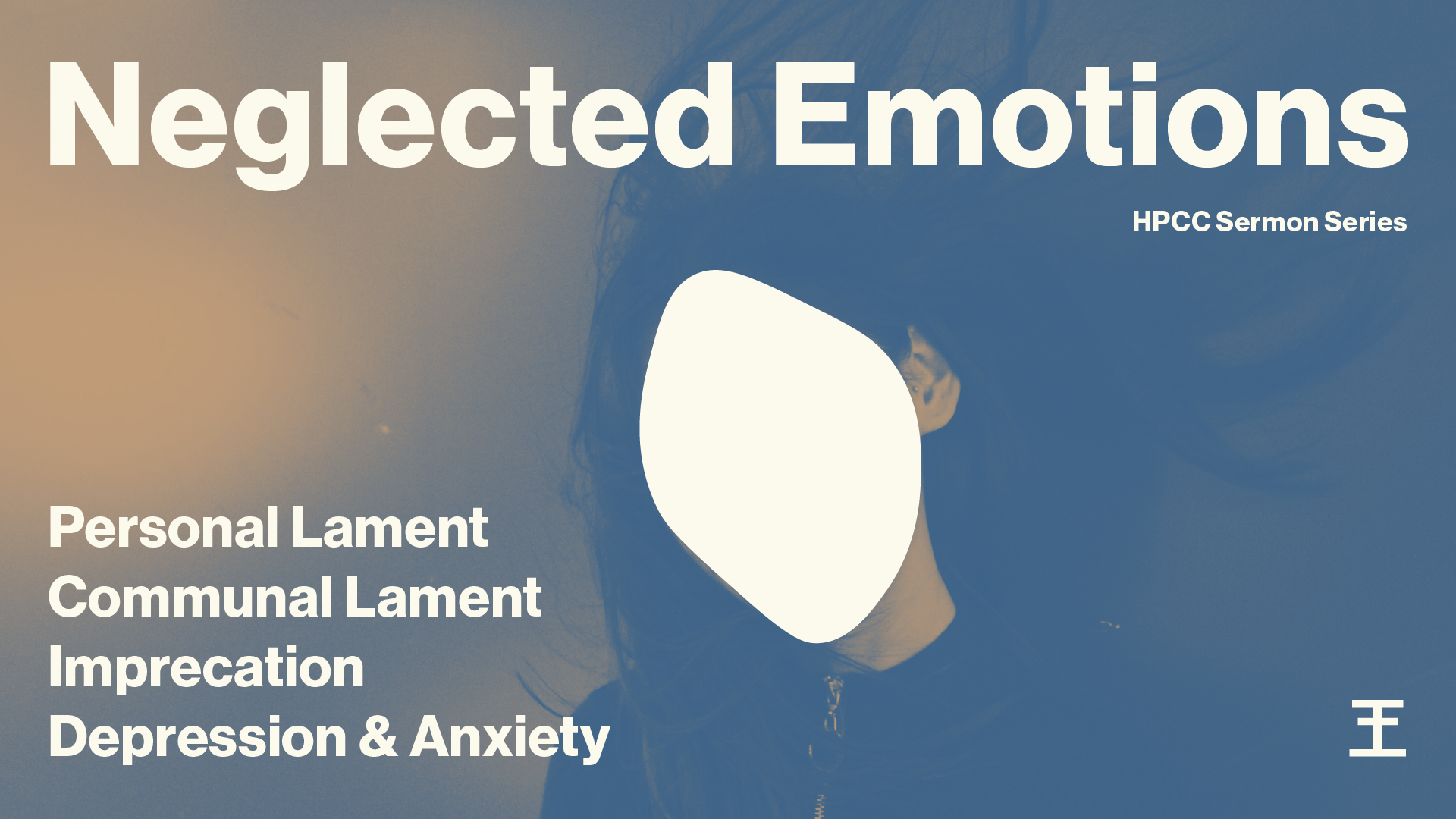
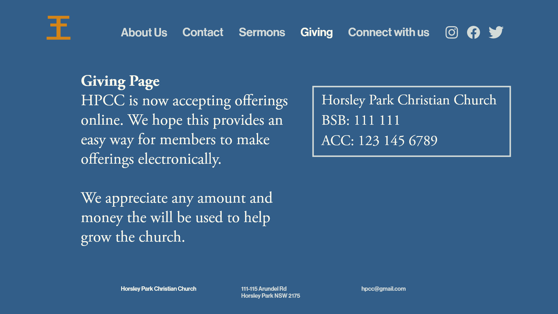
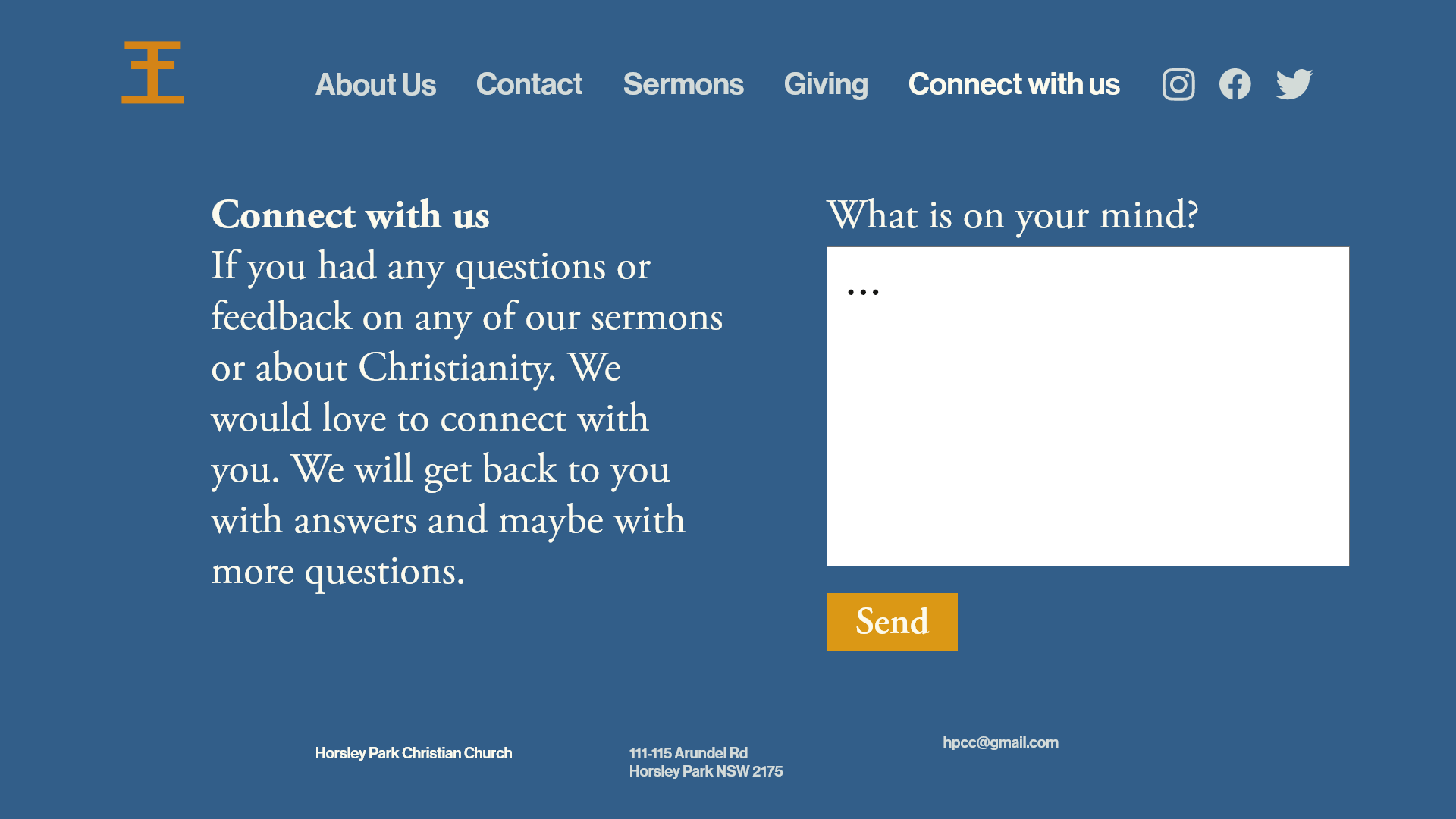
The church has asked to do more designs. I am designing the graphics for future sermon series. I also redesigned and developed their website which is undergoing a launch in the near future.
Testimonial.
After about 30 years of using our old logo for the church, we realised that it was no longer an accurate representation of who we were and in fact, it was probably a turn-off for people engaging with us for the first time. We knew we wanted a fresh look for our church but didn’t know where to go. After throwing around a few ideas and not making much progress we approached Jason to see if he could help us. He took the time to understand where we were and where we wanted to be and delivered a brand identity that could help us get there. The final result was not what we expected but exactly what we wanted!