
For this project I uses Chris Do's suggest design process.

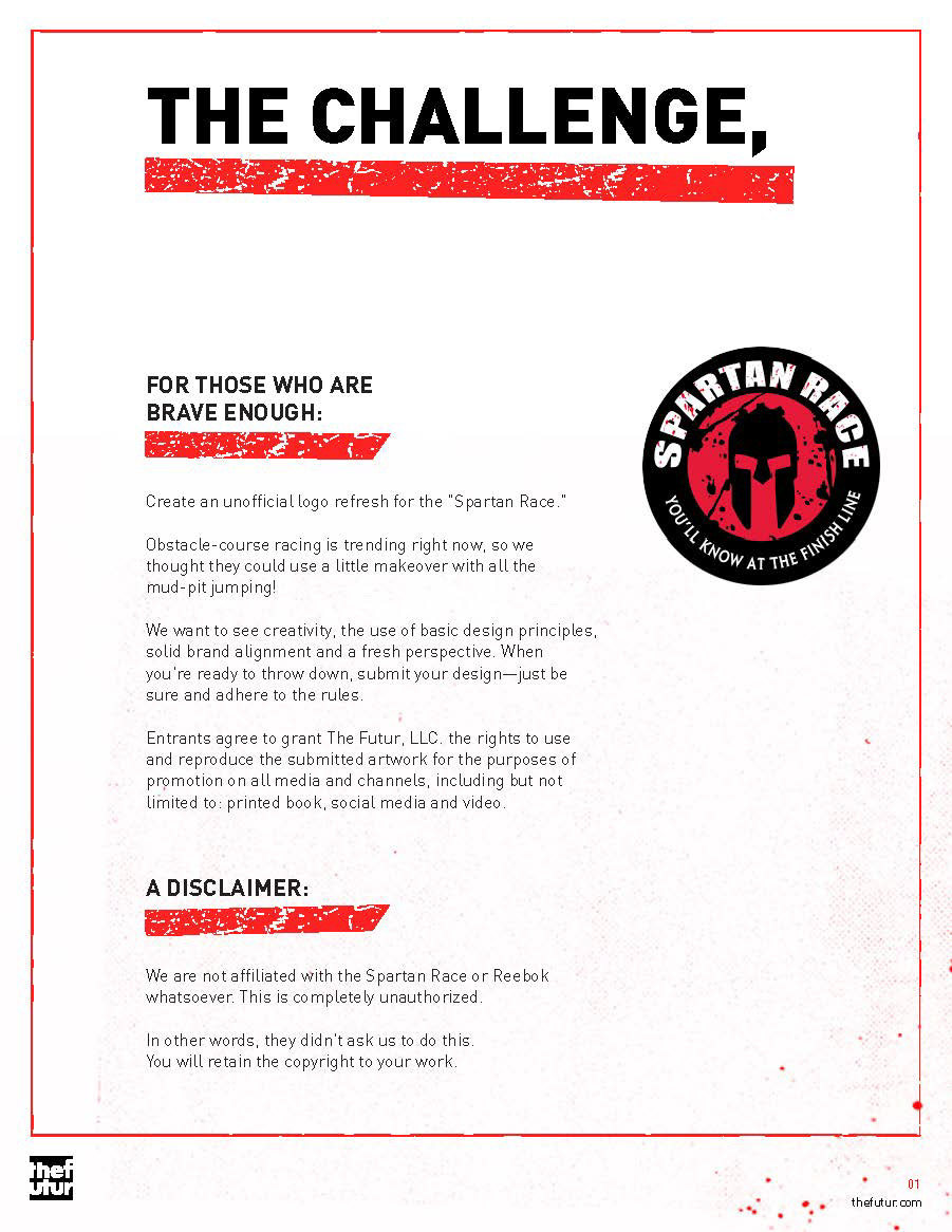
The Brief.
Research.
When I began this project, all I knew about the spartan race was that its some sort of elite obstacle course. Through research, I learned that race is one component of the brand. There are a variety of products under the brand. More importantly, it is a philosophy for self-improvement through training and discipline.
The use of Spartan imagery in their branding is a metaphor for this. The identity needs something that can symbolise this instead of an image of a literal Spartan.
Image Buckets.
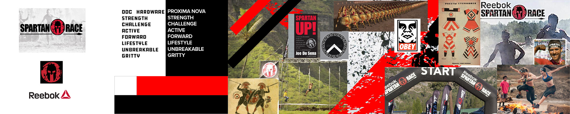
5 visual areas of research: Spartan mythology, The Spartan Race, Mud races, Constructivism and Shepard Fairey.

Stylescape.
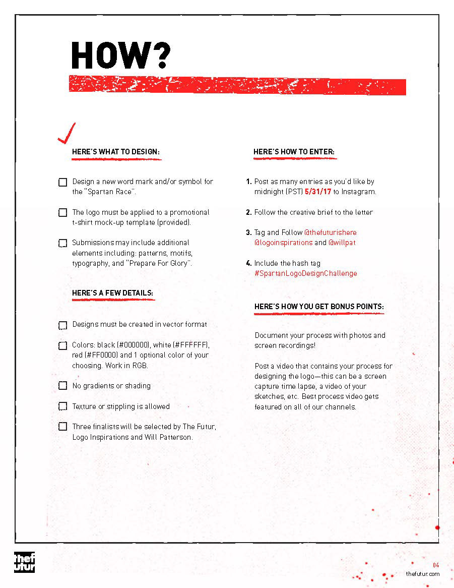
The brief only stated to apply the logo to a t-shirt. I kept in mind that this logo will have to work on a variety of brand applications.
Key values of the Spartan Race brand:
Strength, Challenge, Active, Forward, Lifestyle, Unbreakable, Gritty
Typeface.
DDC type was chosen as the hero typeface as the brand needed a font that had industrial strength, worked when displayed large, and was robust enough to look good if it was damaged
Sketch Ideation.
I explored some design ideas and came up with 4 solid ideas.
1. Spartan concept
2. Superman S concept
3. Lambda with homage to vintage Reebok branding
4. Lambda concept
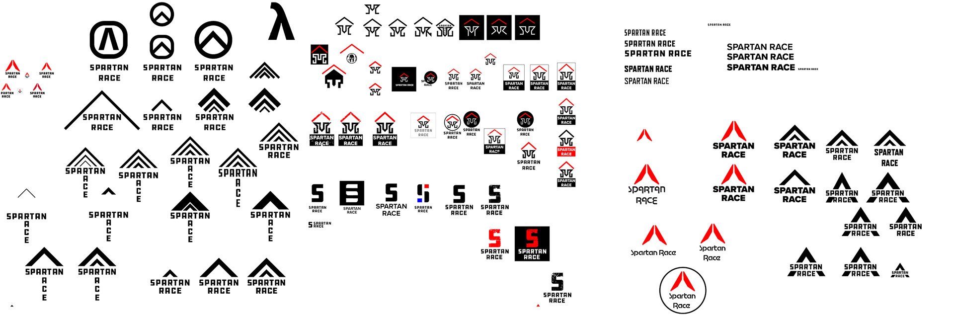

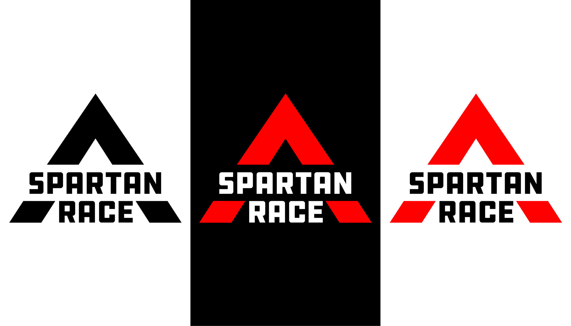
Design.
After posting on Instagram, my lambda design was my strongest concept and further developed. A major development was the removal of the damaged textures. I felt that the logo did not need a texture because:
1. Many applications of the logo will damage it creating textures.
2. In context with other brand applications it will inherit the values.
3. Provides a competitive visual difference.
4. It can work with other parts of the Spartan Race brand.
I felt it was unnecessary to apply a texture so I decided to keep it clean. I focused on creating a logo that was readable when damaged.